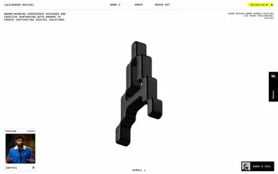
# destroytoday.com — Style Reference
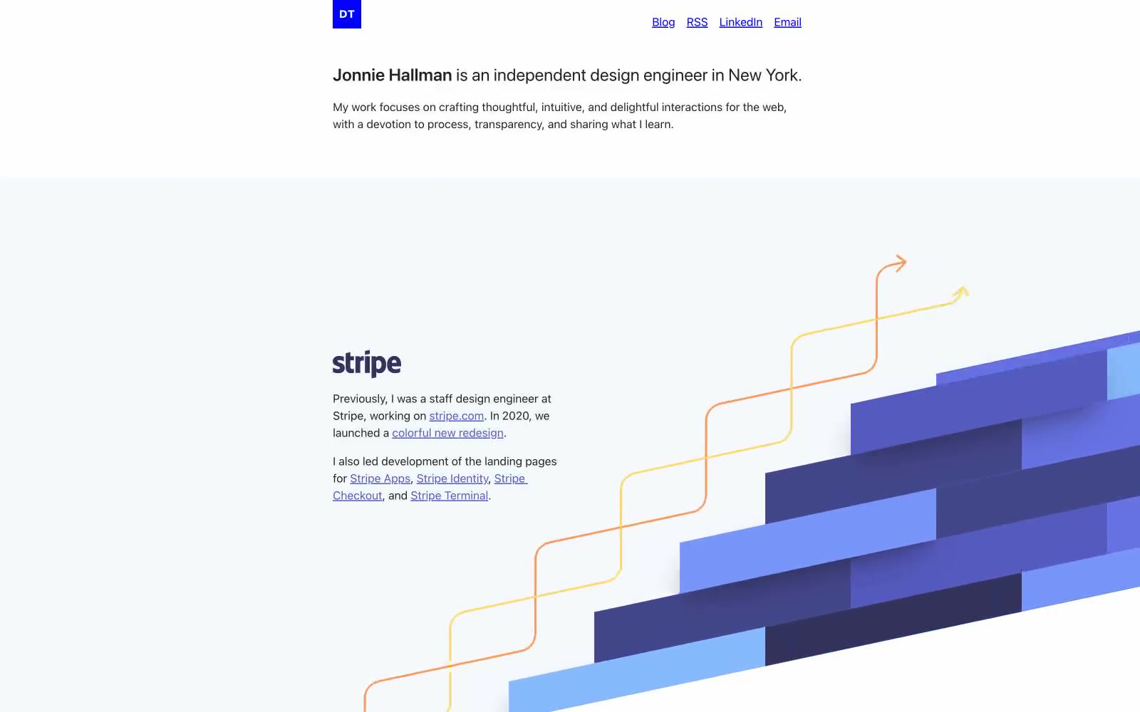
> Designer's monograph on cream paper. A portfolio that reads like a printed document — paragraph text, underlined links, small blue initials stamp, and illustrations that arrive as full-bleed moments between blocks of writing.

**Theme:** light

Source measurements are normalized; roles and recommendations are interpreted. Font summary lists are independent, not paired by position. HTML examples are reconstructions, not source components.

A designer's personal monograph rendered as a quiet, text-first portfolio on white paper. The visual language is almost typographic: a single dark gray on warm white, a tiny blue square logo stamp, underlined links in muted indigo, and paper-warm dividers — like reading someone's printed case studies. Color only enters as illustration accent: a Stripe section with flowing yellow and orange arrows weaving through cobalt gradient blocks, a Casper product photo on bare white, a Dropbox phone mockup with carousel UI. The system deliberately refuses visual noise — no shadows, no gradients on UI, no decorative borders. What breaks the monochrome is meaningful: project imagery and the signature blue stamp that anchors identity.