# Advene — Style Reference
> editorial fashion spread on warm parchment — a gallery catalog that happens to sell handbags

**Theme:** light

Source measurements are normalized; roles and recommendations are interpreted. Font summary lists are independent, not paired by position. HTML examples are reconstructions, not source components.

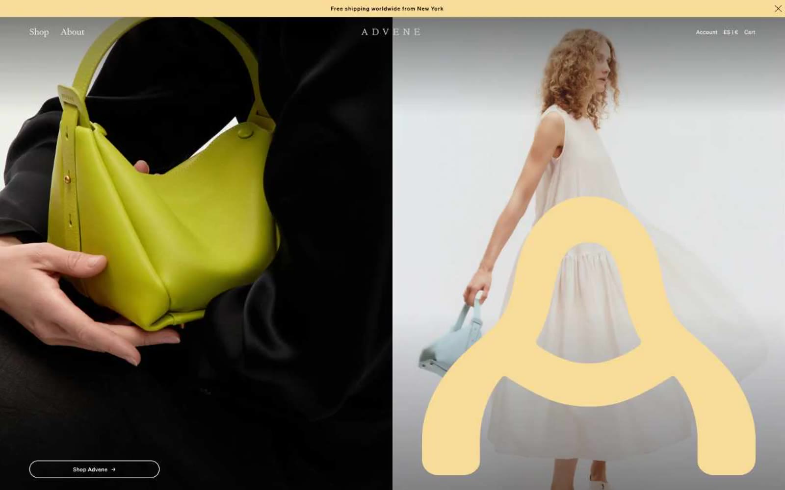
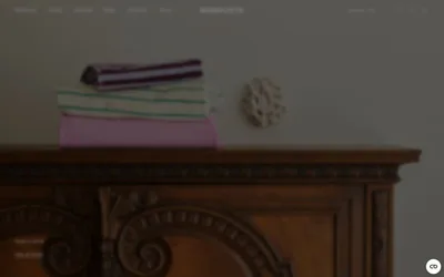
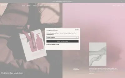
Advene reads as an art-gallery catalog printed on warm parchment: a luxury accessories brand whose interface behaves like an editorial spread rather than a storefront. The canvas is a muted stone-warm gray (#dfe0db) rather than clinical white, and the entire palette is pulled from natural pigments — oxblood, olive, sage, buttercream — with a single unexpected electric blue for outlined actions. Typography is a single humanist serif (Signifier) at restrained sizes, paired with a widely-tracked monospace (Pitch) for micro-labels, creating a tension between book-like body text and almost architectural small caps. Layout is full-bleed and split-screen, sections are separated by generous air rather than dividers, and imagery is treated as artwork — halftone dots, oversized letterforms, and tight portrait crops that bleed edge-to-edge. The overall effect is restrained, expensive, and deliberate: nothing is decorative, everything earns its space.