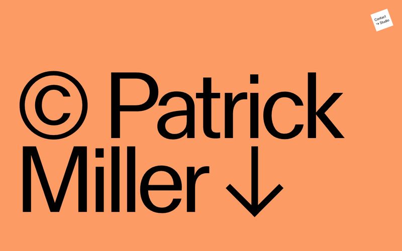
# Patrick Miller — Style Reference
> oversized masthead on chalky color fields — a portfolio that behaves like a printed poster

**Theme:** light

Source measurements are normalized; roles and recommendations are interpreted. Font summary lists are independent, not paired by position. HTML examples are reconstructions, not source components.

Patrick Miller's site treats every viewport as a single editorial spread: full-bleed color fields carry one oversized typographic statement, then a split-screen gallery follows with almost no UI. The palette is warm and chalky — salmon, blush linen, candlelight cream, and a whisper of sage — never digital or saturated, more like pastel chalk dusted across a wall. MlrStandard, a custom sans, does the heavy lifting at extreme sizes (331px hero) with tight tracking, while a near-invisible secondary chrome handles wayfinding: tiny centered labels, hairline arrows, and one small dark circle as the only solid interactive element. There are no cards, no grids, no shadows — content is presented as flat color blocks and monumental type, the way a magazine cover treats a masthead.