# Tomorro — Style Reference
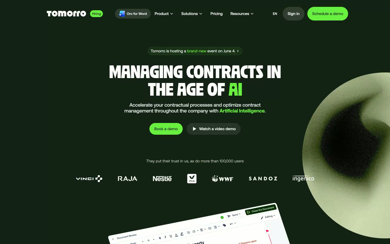
> lush greenhouse at midnight — Electric Sprout neon pierces the deep forest canvas and bone-white beds below. The brand lives in that contrast: the dark is the soil, the light is the greenhouse bench, the green is the growth.

**Theme:** mixed

Source measurements are normalized; roles and recommendations are interpreted. Font summary lists are independent, not paired by position. HTML examples are reconstructions, not source components.

Tomorro is a contract-management platform that renders in a neo-botanical dark-and-light system: deep forest-canvas sections alternate with warm bone-white panels, both fed by the same Moss-Shadow text and punctuated by an Electric Sprout green. The visual language is quiet, mature, editorial — Ozik display type at ultra-tight 0.86 line-height anchors the hero, Aeonik carries every UI surface, and Instrument Serif drops in sparingly as accent italic-adjacent voice inside badges. Components are mostly pill-shaped (28-40px radius) rather than squared, the floating nav bar looks like a pressed seed, and the green CTA is treated as botanical accent paint, not a brand wallpaper. Pages should read as 70% typography on flat surfaces, 20% product mockups floating at slight angles, 10% abstract green orb atmosphere.