# Sandland Sleep — Style Reference
> warm cream sleep journal with deep navy nights

**Theme:** light

Source measurements are normalized; roles and recommendations are interpreted. Font summary lists are independent, not paired by position. HTML examples are reconstructions, not source components.

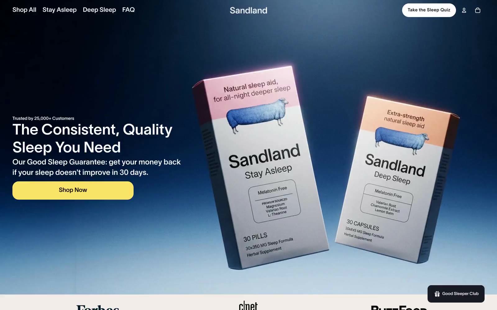
Sandland Sleep uses a warm cream canvas as its foundation, creating a soft, restful atmosphere that reads like a linen-wrapped pharmacy rather than a cold e-commerce site. Deep navy (#1a365d) provides the nighttime counterpart — anchoring the hero gradient and dark data cards as moments of cool, clinical authority that contrast the otherwise warm palette. A single vivid yellow (#fae467) serves as the sole chromatic punctuation for primary actions, badges, and data highlights, making every CTA feel switched on against the muted surroundings. Typography stays restrained and even, with a custom sans (Sandland-550) at moderate weights and tight tracking on display sizes, letting generous spacing and soft 10-20px radii carry the calm. Components are pill-shaped and rounded, shadows are whisper-soft (0.1 opacity), and the overall feel is a sleep journal: warm paper, navy ink, one highlighter.