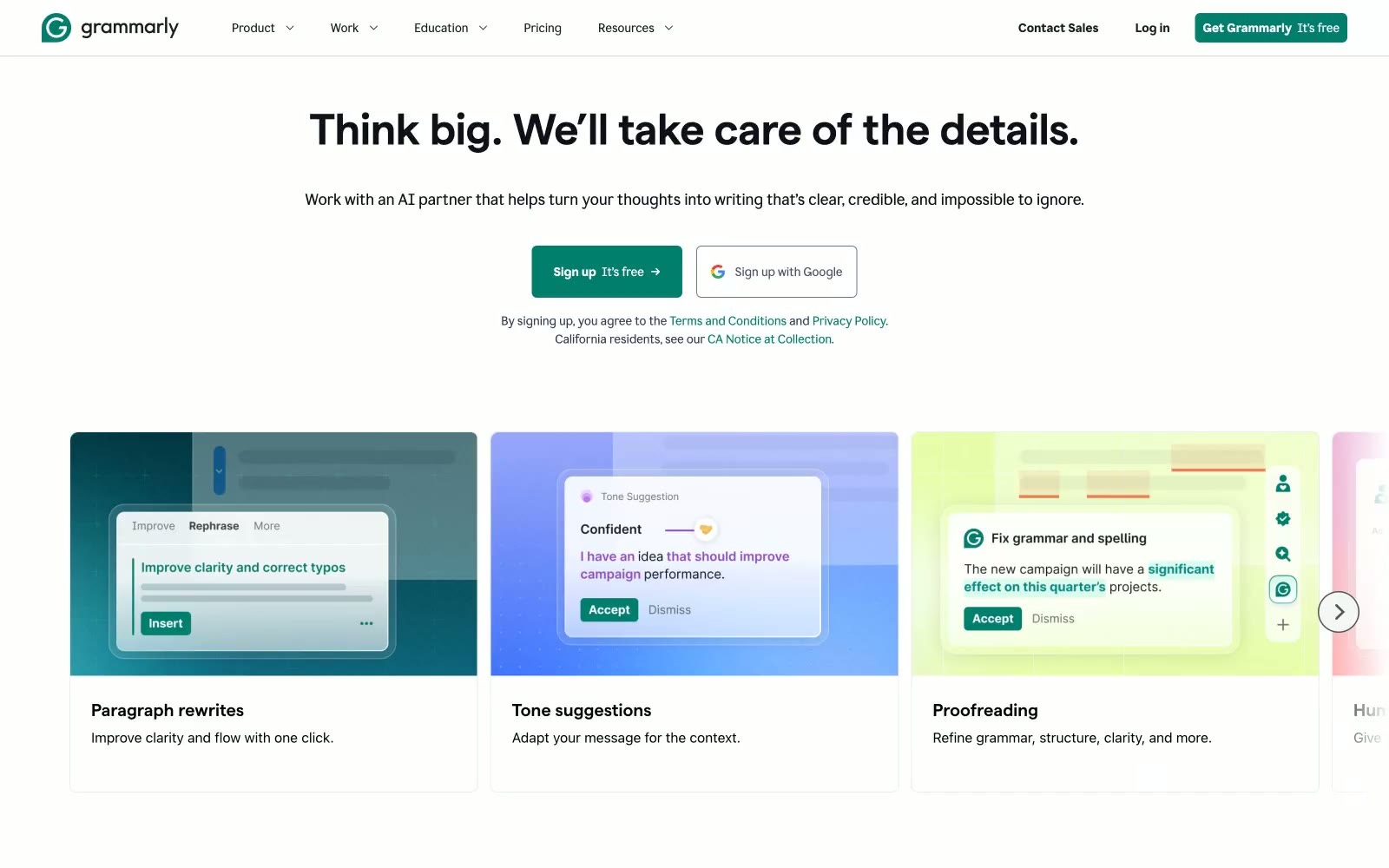
# Grammarly — Style Reference
> Thoughtful editor's desk — restrained, precise, one confident accent

**Theme:** light

Source measurements are normalized; roles and recommendations are interpreted. Font summary lists are independent, not paired by position. HTML examples are reconstructions, not source components.

Grammarly's design system reads like a considered editorial workspace: a near-white canvas, confident dark typography, and a single deep teal that signals action. The custom display face 'matter' (weight 670) carries a compressed, geometric authority at large sizes, while 'Glyph' handles body copy with a quieter, humanist warmth. Components are restrained — 8px corners, hairline borders, ghost controls, minimal elevation — letting the teal CTA and the occasional dark enterprise band do the emotional work. Surfaces are flat and paper-like; shadows are nearly absent. The palette is 90%+ achromatic, with teal appearing as functional punctuation for buttons, links, active states, and full-bleed brand sections.