# Vimeo — Style Reference
> Spotlight on matte white

**Theme:** mixed

Source measurements are normalized; roles and recommendations are interpreted. Font summary lists are independent, not paired by position. HTML examples are reconstructions, not source components.

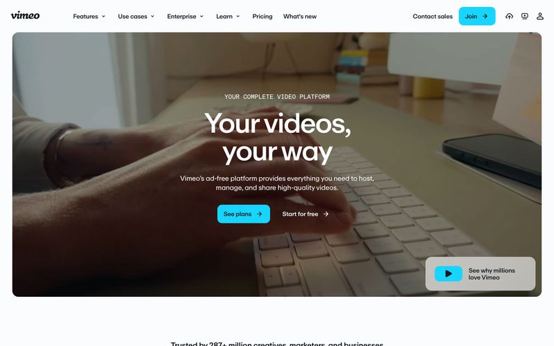
Vimeo's visual language treats the page as a matte white gallery wall where one electric cyan accent acts as the only spotlight. The dominant canvas is near-white (#fafcfd) with a deep ink (#141a20) used sparingly for cinematic dark bands, and a single vivid #17d5ff cyan that appears exclusively on action elements — never on decoration, illustration, or background fills. Typography carries the brand's editorial weight: a custom neo-grotesque (ABCRepro) at 400/500/700 with aggressive negative tracking at display sizes (-0.05em at 72px), tight 1.20 leading on body, and 1.00 leading on oversized headlines that makes them feel architectural. The layout alternates between breathing light sections and dense dark platforms, creating a vertical rhythm that mirrors the site's own product (lightness for browsing, darkness for viewing). Components are flat, low-elevation, and slightly rounded — 8px on buttons and inputs, 16px on cards, 9999px on tags. Density is compact: 8px and 16px do the heavy lifting, with 24px marking section breaks rather than breathing room.