# DNCO — Style Reference
> editorial gallery on white linen.

**Theme:** light

Source measurements are normalized; roles and recommendations are interpreted. Font summary lists are independent, not paired by position. HTML examples are reconstructions, not source components.

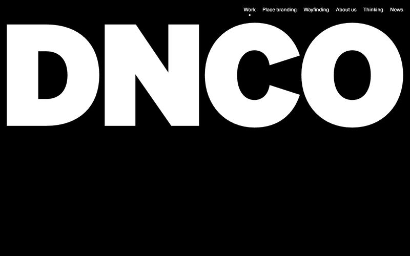
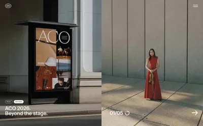
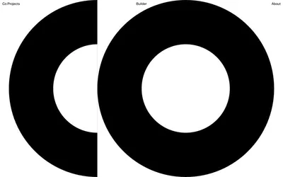
DNCO operates on radical typographic restraint: a single sans-serif at a single weight (Neue Haas Unica Pro, 400) deployed across a 72px-to-16px scale, anchored on a near-achromatic palette of white, off-white, and pure black. The site reads like an editorial print spread — headlines breathe against generous whitespace, borders are whisper-thin hairlines (#e5e7eb), and the only color in the system comes from project photography, never from chrome or accent fills. Navigation and interactive elements are pill-shaped (9999px radius), text is always the interactive primitive, and the brand wordmark doubles as a full-bleed hero that inverts to black. Components are minimal, weightless, and border-driven rather than shadow-driven — the aesthetic is gallery catalogue, not SaaS dashboard.