# Atlassian — Style Reference
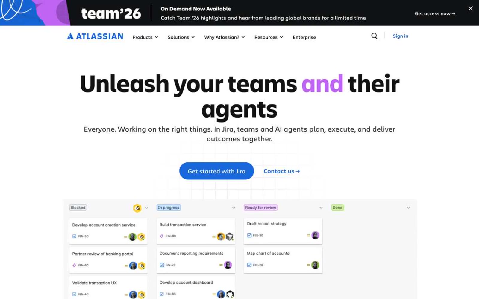
> Confetti-edged engineering blueprint. A clean white enterprise canvas interrupted by dark navy editorial panels framed in torn geometric color — vivid violet, taxicab yellow, electric blue, leaf green — like precise diagrams pinned between paint-splattered dividers.

**Theme:** light

Source measurements are normalized; roles and recommendations are interpreted. Font summary lists are independent, not paired by position. HTML examples are reconstructions, not source components.

Atlassian operates as an enterprise workshop dressed in casual confidence: a white canvas where dense product interfaces meet bold, colorful editorial moments. The visual system splits between quiet functional surfaces (white, light gray, subtle blue) and expressive dark hero blocks (near-black navies) framed by fragmented geometric confetti in vivid violet, yellow, blue, and green. Typography is a paired custom sans family — Charlie Text for dense UI, Charlie Display for editorial headlines that grow to 80px with tightened tracking. Components are large, rounded, and borderless — pills for actions, generous 20px radii for cards, almost no shadow. Color is disciplined: one electric blue drives every primary action and link, while chromatic energy lives only in decorative edges and section dividers, never bleeding into functional UI.