# Stocketa — Style Reference
> Neon aurora on frosted glass — a light, weightless interface floating beneath a prism-washed sky.

**Theme:** light

Source measurements are normalized; roles and recommendations are interpreted. Font summary lists are independent, not paired by position. HTML examples are reconstructions, not source components.

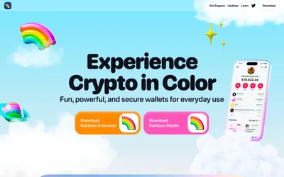
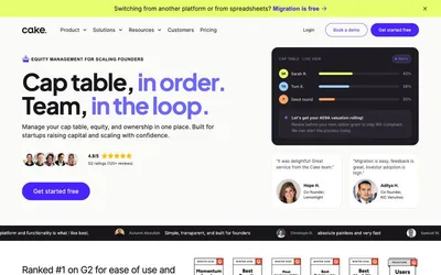
Stocketa floats its product on a dreamy light canvas washed with a soft radial aurora — green, teal, purple, and pink bleeding from the top — where the color is felt as atmosphere rather than seen as decoration. The interface below stays calm and almost achromatic: white cards, hairline borders, and a signature three-layer shadow (a faint blue-tinted outer drop, a 1px white inner highlight, and a barely-there navy inset) that whispers elevation instead of declaring it. A single vivid magenta (#995bb9) does all the emotional work — painting headlines as a left-to-right gradient, filling icons, and pulling the eye through each section. Typography is a custom geometric sans (averta standard) cut for very tight negative tracking at display sizes up to 98px, giving even the biggest headlines a compressed, confident posture. The phone mockup is the hero: it sits at the visual center of every section, turning the product itself into the brand's primary visual asset.