# Obviously — Style Reference
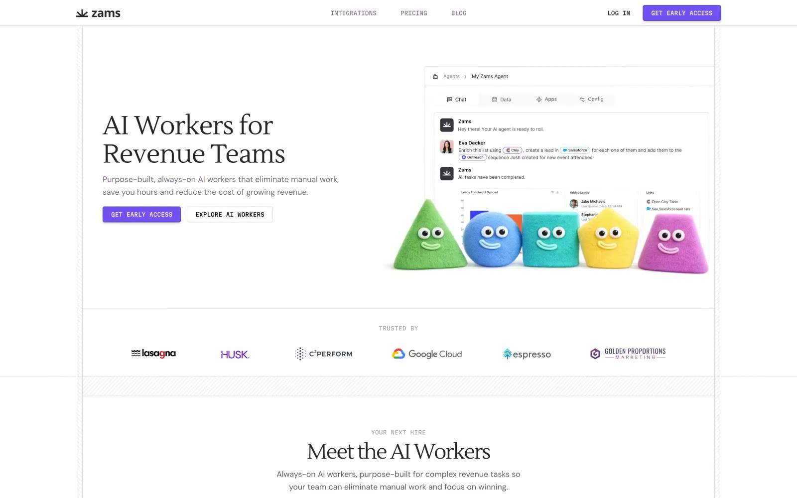
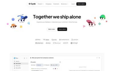
> Whimsical claymation on white paper. Zams stages friendly geometric play-doh creatures on a clean, almost clinical white backdrop, letting one vivid violet do all the chromatic work and a warm serif handle the typographic warmth.

**Theme:** light

Source measurements are normalized; roles and recommendations are interpreted. Font summary lists are independent, not paired by position. HTML examples are reconstructions, not source components.

Zams runs a dual-language visual system: a rigorously minimal, serif-headed enterprise aesthetic married to a cast of chubby, candy-colored claymation characters that embody the AI workers themselves. The white canvas is intentional stage-craft — it lets the violet CTA (#7451f2), the subtle dotted-grid patterns, and the pastel mascots carry all the visual personality while the surrounding chrome (tabs, integration logos, compliance badges) stays quietly functional. Headlines use a warm serif (Lustria) with tight negative tracking, body and UI run on DM Sans, and labels like "COMING SOON", "EVAN", and "YOUR NEXT HIRE" shift into Martian Mono to give sections a technical, almost build-log voice. Components are square-jawed: 4px corners, hairline borders, one subtle button shadow, and no decorative gradients. The overall tone is enterprise-credible but never sterile — the mascots break the tension, and the monospace meta-labels signal "this product is engineered, not assembled."