# Airbnb — Style Reference
> Quiet white gallery wall with one coral-red bookmark

**Theme:** light

Source measurements are normalized; roles and recommendations are interpreted. Font summary lists are independent, not paired by position. HTML examples are reconstructions, not source components.

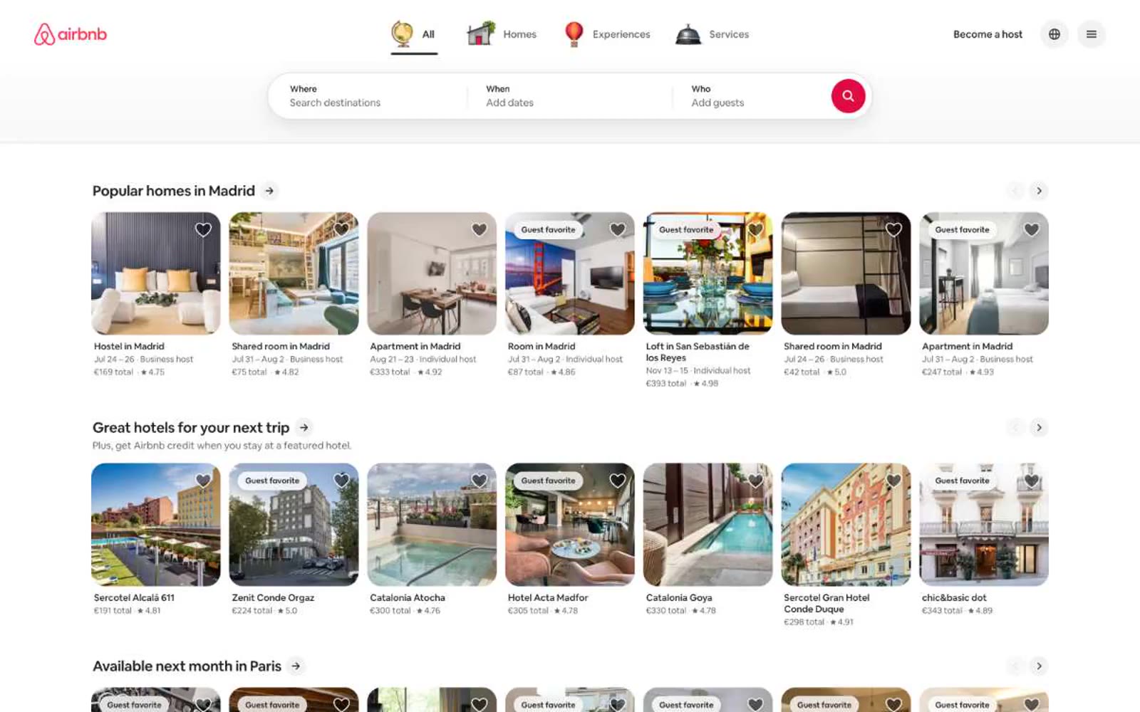
Airbnb operates on a white-canvas, photograph-first vocabulary: nearly every screen is a quiet monochrome frame that lets full-bleem property imagery carry the experience, with a single saturated coral-red accent (Rausch) as the only chromatic punctuation for action. Typography is set in a custom geometric sans (Airbnb Cereal VF) at mostly small, confident sizes — 14px body, 16px UI, 22–28px section titles — with tight negative tracking and generous line-height that keeps dense listing cards readable. The interface is flat, borderless, and rounded: 12–14px radii on cards and controls, pill-shaped circular buttons, and soft layered shadows only for elevated overlays like the search bar. Everything else — cards, list items, links — relies on whitespace and hairlines rather than chrome.