# BUTT STUDIO — Style Reference
> gallery wall with one massive serif wordmark

**Theme:** light

Source measurements are normalized; roles and recommendations are interpreted. Font summary lists are independent, not paired by position. HTML examples are reconstructions, not source components.

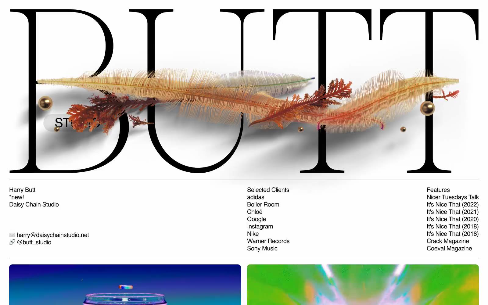
BUTT Studio is an editorial portfolio that treats type as architecture: one enormous Caslon wordmark stretches wall-to-wall across the top of the page, broken by an organic illustration that weaves through the letterforms. Below the hero, the system collapses into a clinical three-column ledger of contact, clients, and features in a quiet sans-serif, then opens into a generous two-column project grid. Color is almost entirely absent — matte black ink on warm gray paper, with a single deep indigo badge as the only chromatic punctuation. The feel is a print magazine that happens to be alive: confident serif display, utilitarian sans body, no gradients, no rounded chrome, no decorative shadows.