# boords.com — Style Reference
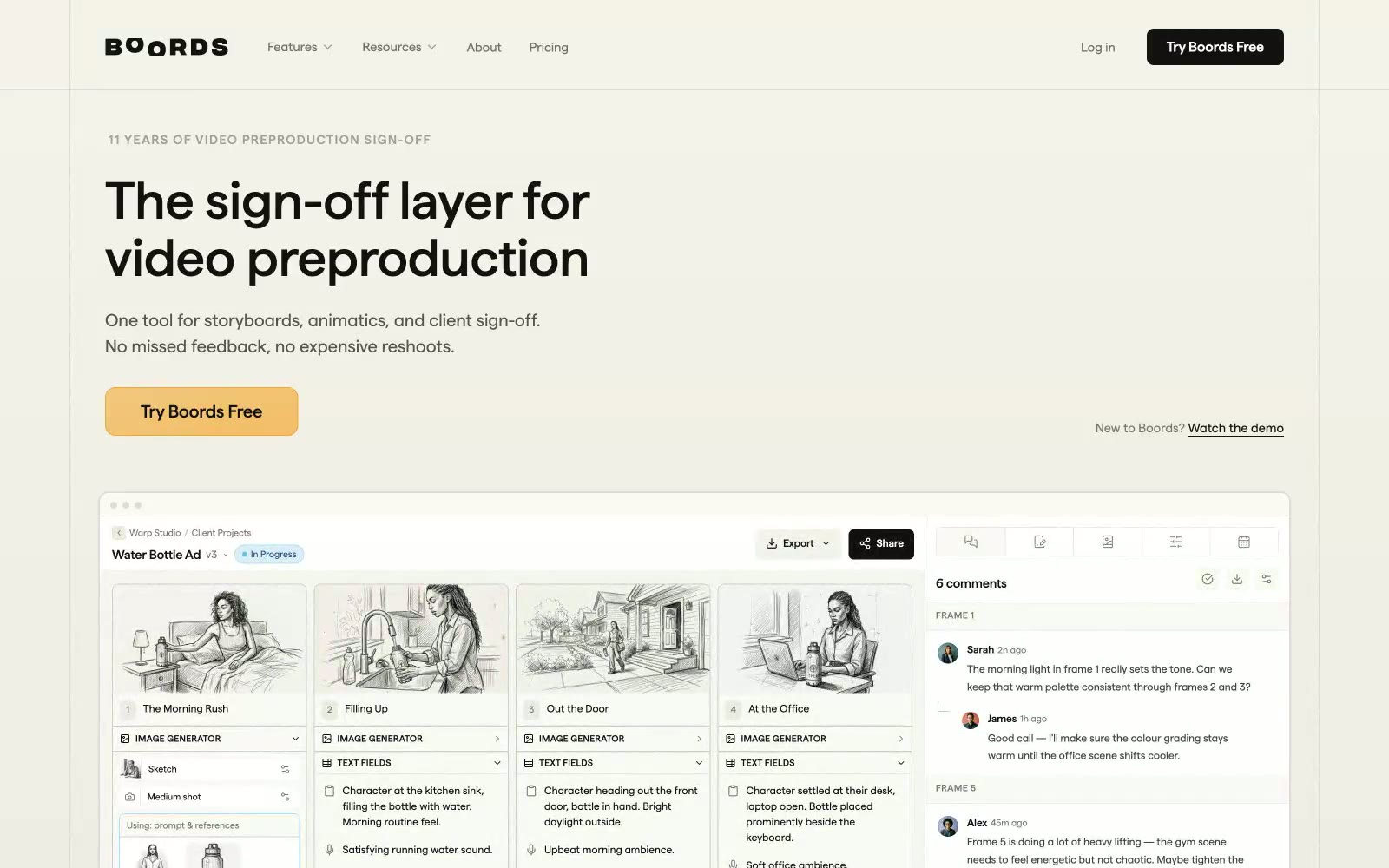
> Warm storyboard studio on cream paper — a cream canvas, amber pencil accents, and flat geometric type that feels hand-drawn even when it's pure UI.

**Theme:** light

Source measurements are normalized; roles and recommendations are interpreted. Font summary lists are independent, not paired by position. HTML examples are reconstructions, not source components.

Boords operates in a warm, paper-like visual register: a cream canvas (#fafaf5) sits beneath pure white surfaces, with a single amber accent that feels more like a pencil highlight than a digital CTA. The custom 'matter' typeface carries a geometric, friendly character at every scale, with positive tracking on small-caps eyebrows and tight, confident headlines at 32–60px. The interface is deliberately flat — 6px corners are the default radius, shadows are nearly absent, and one dark section (the developer/API area) breaks the cream monotony without disrupting the calm. The aesthetic borrows from the storyboard world it serves: warm neutrals, soft radii, amber-warm action colors, and a hand-drawn quality in the product imagery that makes the UI feel like a creative tool rather than a productivity app.