# Little Amps — Style Reference
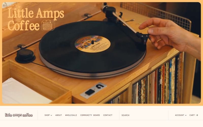
> vinyl record sleeve in afternoon sun. Cream paper, burnt-orange ink, a single dusty blue stamp, every label set in monospace — the interface behaves like a printed coffee zine: tactile, editorial, never sterile.

**Theme:** light

Source measurements are normalized; roles and recommendations are interpreted. Font summary lists are independent, not paired by position. HTML examples are reconstructions, not source components.

Little Amps is a warm analog coffee-shop world: cream-paper canvas, rich espresso-brown type, and burnt-orange accents that feel like sun-faded label ink. The interface reads like a printed zine or vinyl insert — a custom chunky display serif handles headlines while monospaced type (Necto Mono, Roboto Mono) labels everything that is structural: nav, buttons, prices, dates, callouts. Photography is documentary and tactile (hands on records, café counters, coffee cherries) and anchors every section. Color is sparse but decisive: a single vivid red-orange does the work of links and highlights, a dusty blue and marigold yellow appear as quiet secondary signals. Surfaces are flat, borders are hairline warm-taupe lines, and radius stays small (3–8px) — the aesthetic is curated and editorial, not soft or rounded.