# Flowmapp — Style Reference
> White blueprint desk with one blue pen

**Theme:** light

Source measurements are normalized; roles and recommendations are interpreted. Font summary lists are independent, not paired by position. HTML examples are reconstructions, not source components.

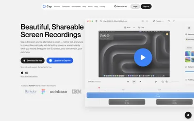
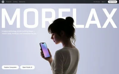
Flowmapp uses a bright, airy, almost lab-notebook language: near-pure white canvas, oversized bold black headlines, pill-shaped blue CTAs, and a constellation of small floating product mockups that act as proof rather than decoration. The system relies on a single vivid blue (#0080ff) as the only saturated signal, with everything else staying achromatic or near-gray so that color reads as action, not as noise. Shapes are aggressively rounded — cards arc at 20–32px, buttons and tags become full pills at 1600px, and the hero CTA even has a hand-drawn wavy tail that makes the primary action feel sketched rather than templated. Layout is max-width contained with generous breathing room; content is broken by small product screenshots, floating UI fragments, and a row of pastel circular icon badges that punctuate long-form copy.