# Tatem — Style Reference
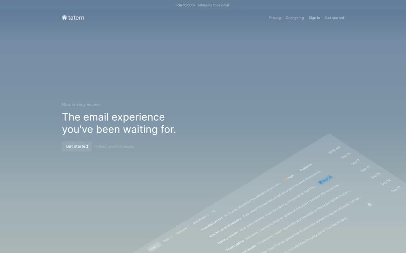
> calm twilight command center — a hushed dark workspace washed in a single soft blue-to-charcoal gradient, with one warm sunburst as the only color punctuation.

**Theme:** dark

Source measurements are normalized; roles and recommendations are interpreted. Font summary lists are independent, not paired by position. HTML examples are reconstructions, not source components.

Tatem operates in a hushed, dark twilight palette where nearly the entire interface is rendered in neutral grays and near-black surfaces, creating a calm, focused environment for an email client. The hero breaks the monochrome with a single soft blue-gray gradient that fades to black, framing a large left-aligned headline and a gently rotated app preview. Typography is exclusively Inter at weight 400, relying on size and letter-spacing to establish hierarchy rather than weight contrast. Components stay flat and minimal: ghost buttons with thin borders, 6px-radius cards, keyboard shortcut chips, and inbox rows that use spacing and subtle gray separators rather than borders or shadows. The visual signature is restraint — one warm sunburst icon is the only chromatic punctuation, and the rest of the system communicates through negative space, neutral gradients, and whisper-quiet text colors.