# Sprig — Style Reference
> editorial research notebook on warm paper — quiet, almost inkless, with warm light leaking in at the edges

**Theme:** light

Source measurements are normalized; roles and recommendations are interpreted. Font summary lists are independent, not paired by position. HTML examples are reconstructions, not source components.

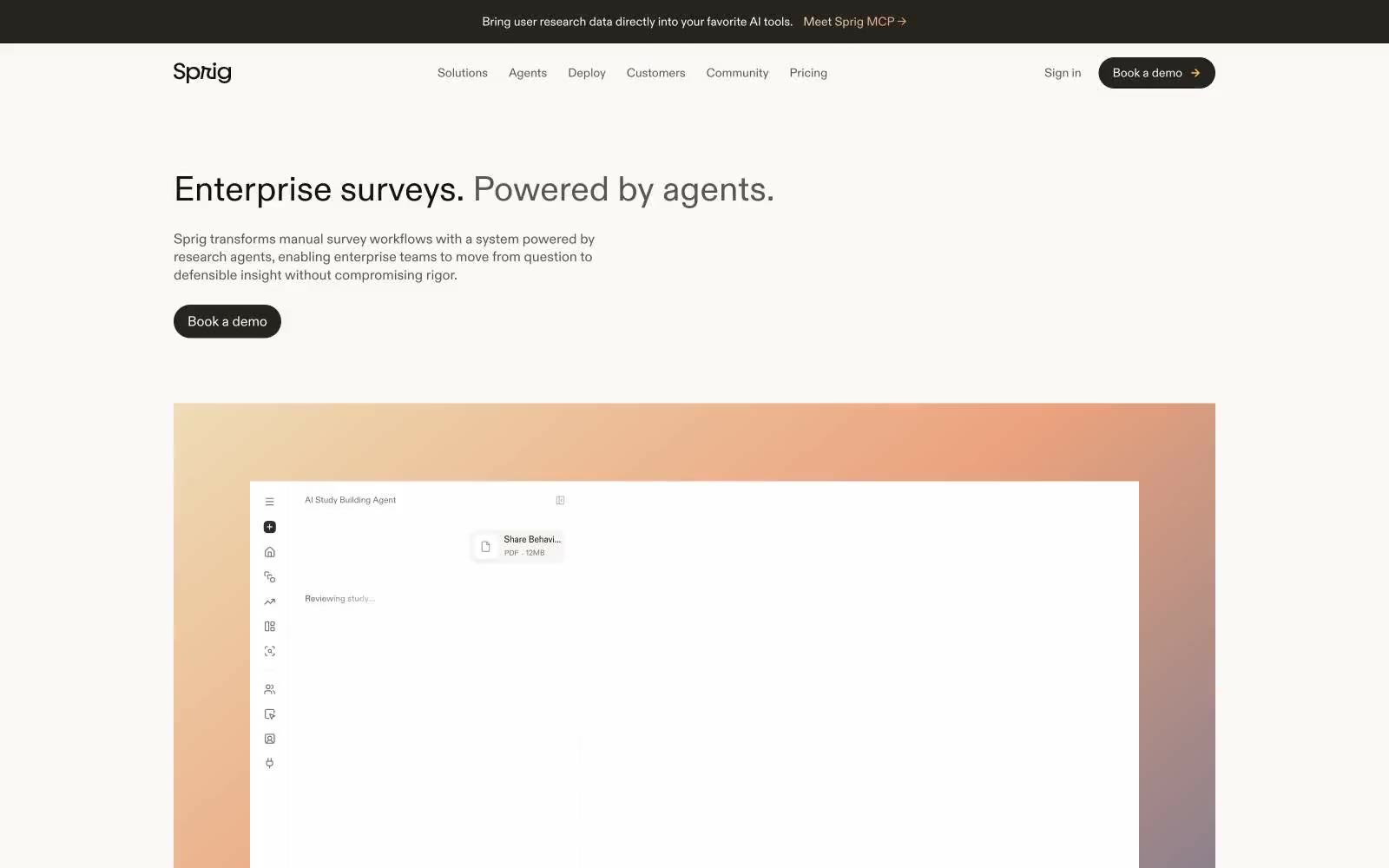
Sprig operates in a near-monochrome editorial register: a warm bone-white canvas, hairline borders, and a single ink tone so dark it reads as black but carries a barely-there navy undertone. The system feels like a research notebook — quiet, confident, and deliberately undecorated — punctuated by warm sunset gradients that act as section markers rather than decoration. Typography is two custom families in conversation: ABC Diatype for the editorial moments (headings, display) and TT Commons Pro for the functional UI (nav, buttons, labels). Components are pill-shaped and generously spaced; cards can be nearly circular (100px radius) for feature moments, creating a visual contrast between the very-soft and the very-structured. Color is rationed: the only chromatic color in the interface is the near-black ink itself, and gradients are reserved for hero and event imagery — never on buttons, never on controls.