# Micro — Style Reference
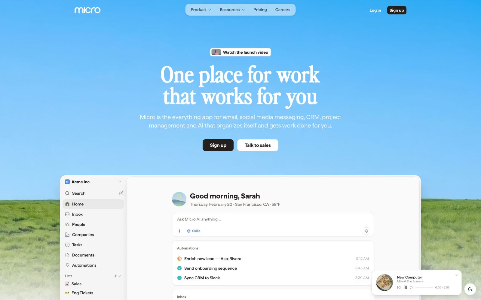
> sunrise over a digital meadow — a calm horizon gradient holding a quiet, ink-on-paper workspace beneath it.

**Theme:** light

Source measurements are normalized; roles and recommendations are interpreted. Font summary lists are independent, not paired by position. HTML examples are reconstructions, not source components.

Micro is a sunrise productivity workspace: a chromatic blue-to-teal gradient sky opens the page, then drops into a quiet, neutral canvas of warm off-white with a near-black ink text color. The signature typographic move pairs a chunky editorial display face (perfectlyNineties) for oversized headlines with a neutral workhorse (haffer) for the dense product UI — giving marketing pages a magazine-cover gravity and product screens a calm, readable density. Color is used as functional punctuation: one azure blue (#518bdb) for actions, plus a pastel accent system (mint, peach, lavender, teal-mist) for soft surface washes and a small multicolor icon palette (teal, pink, red, orange, green) that signals connectivity and categories. Components are flat-first, bordered and gently shadowed rather than heavily elevated; radii cluster at 8px and 14px, with 18px for the larger product cards. The overall feel is a software product that has been allowed to breathe — open, friendly, slightly nostalgic in its display type, but precise in its data-rich product surfaces.