# Shares — Style Reference
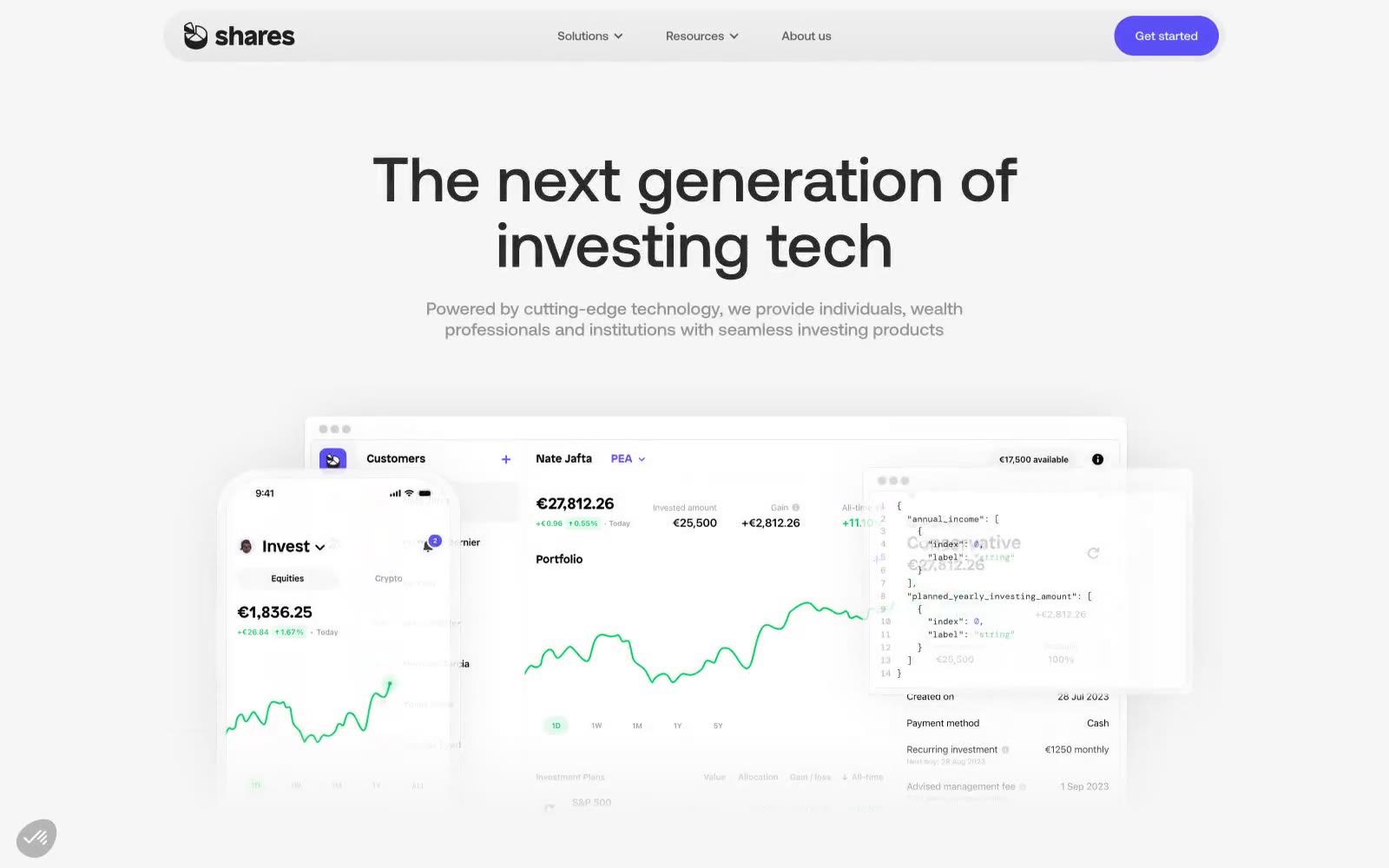
> Ivory terminal with violet pulse — a clinical white workspace where one color marks every deliberate action.

**Theme:** light

Source measurements are normalized; roles and recommendations are interpreted. Font summary lists are independent, not paired by position. HTML examples are reconstructions, not source components.

A monochromatic fintech interface on near-white surfaces, where one vivid violet does all the talking. The visual language is sparse and confident: no decorative gradients, no chromatic ornamentation, no shadow theatrics. Everything sits on flat porcelain with dark charcoal text, and the only color that earns attention is Signal Violet (#594ff4), reserved strictly for action — filled buttons, active links, brand marks. Components lean on geometry rather than depth: pill-shaped controls (99px radius), generously rounded cards (36px), and soft 1px gray dividers instead of elevation. Typography is geometric and tightly tracked, with large headlines at compressed line-heights (1.05–1.15) that feel architectural rather than editorial. Product mockups float in layered, slightly overlapping arrangements — phone + dashboard + code panel — anchored by a single brand color.