# Cards Against Humanity — Style Reference
> Apocalypse broadcast on blackout paper

**Theme:** dark

Source measurements are normalized; roles and recommendations are interpreted. Font summary lists are independent, not paired by position. HTML examples are reconstructions, not source components.

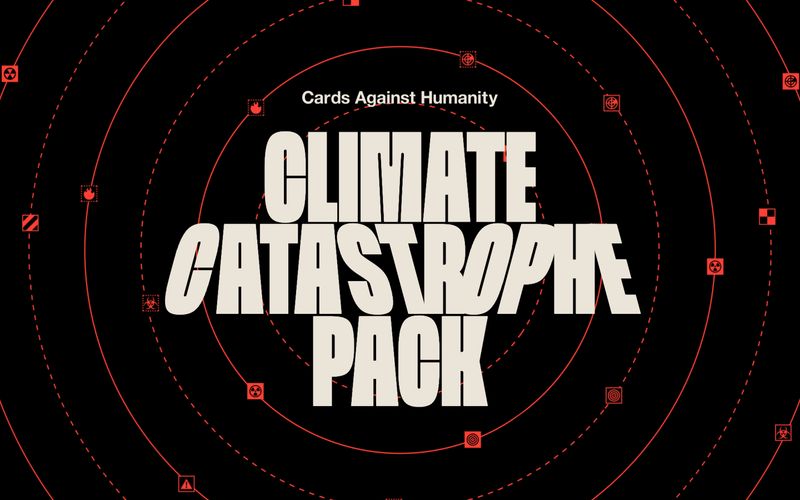
Cards Against Humanity's Climate Catastrophe Pack deploys an emergency-broadcast aesthetic: a pitch-black canvas saturated with flat, vivid red as the only chromatic signal. Typography does almost all of the heavy lifting — an extreme condensed display face (Spektra) stacked in 200+ px blocks creates poster-sized alarm, while the body text is a quiet, humanist sans (Helvetica Neue) that reads like a caption on a civil defense poster. The page is content-sparse and editorial: no dashboards, no product cards, no marketing chrome — just a large headline, centered prose, and scattered red hazard glyphs orbiting a radar/concentric-circle motif. Color is used surgically: cream for almost all readable text, red reserved for annotations (strikethrough corrections, underlined links, flame graphics, icon squares), with the red itself functioning less as decoration than as a wayfinding color for 'pay attention here.' There is essentially no elevation system, no soft cards, no shadows — the design rejects SaaS niceties in favor of a printed-flyer feel where information sits directly on the black page like ink on a wall.