# Superr — Style Reference
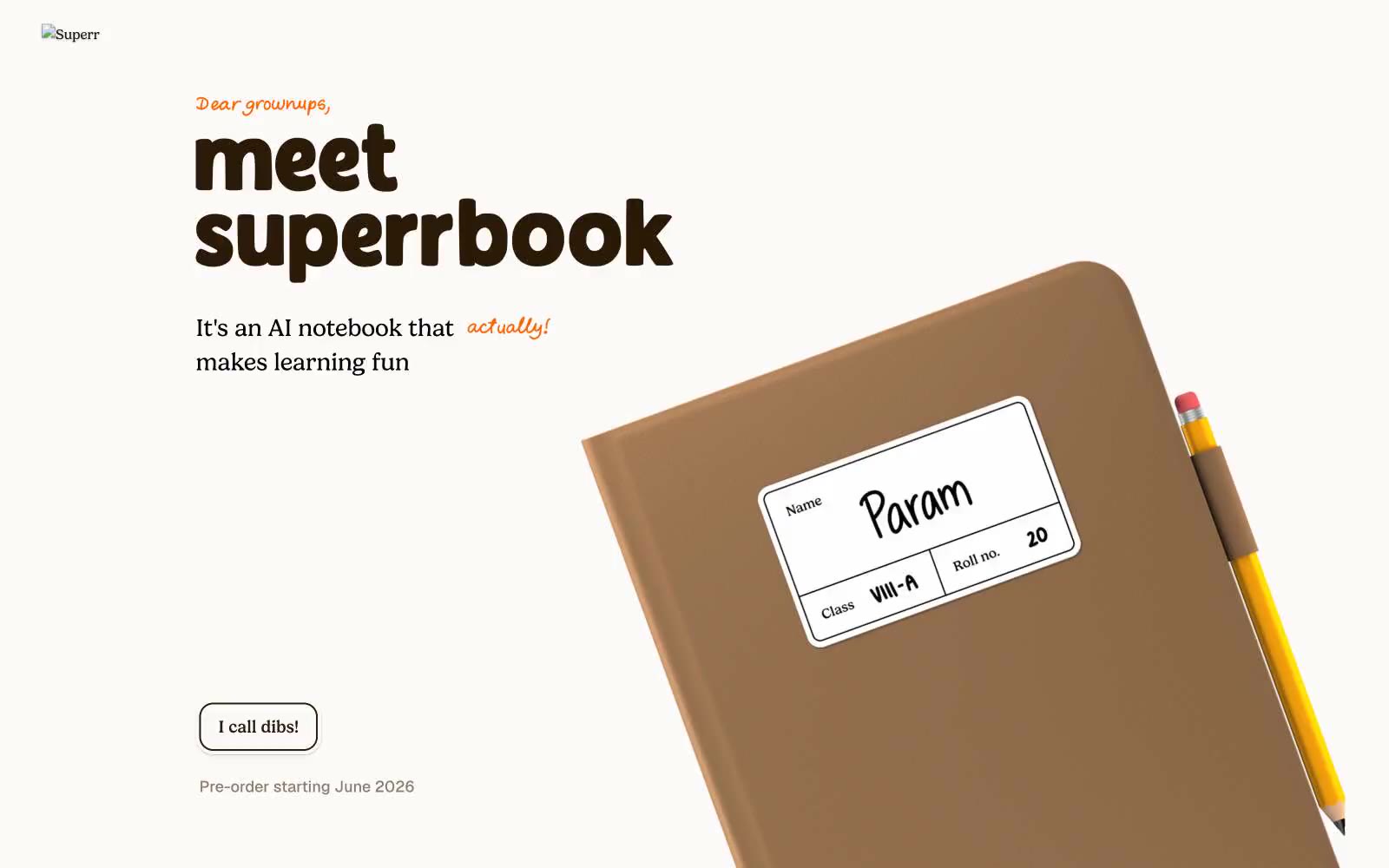
> Warm schoolyard notebook in soft afternoon light. A cream page, an orange marker uncapped, and a stack of sticker-laminated name labels waiting to be peeled.

**Theme:** light

Source measurements are normalized; roles and recommendations are interpreted. Font summary lists are independent, not paired by position. HTML examples are reconstructions, not source components.

Superr is a warm schoolyard aesthetic rendered in digital form: a cream-paper canvas, hand-marker orange as the only chromatic accent, and chunky lowercase display type that reads like a child's notebook scrawled at full volume. The product itself is photographed like a real object — leather-bound notebooks, colored pencils, sticker-laminated name labels — and these objects, not abstract UI illustrations, do the visual work. Playful illustrated stickers (lightning bolts, bears, hearts, ghosts) scatter across the layout as little bursts of personality, but they are decorative punctuation, not system icons. Every surface stays matte and soft: thin dark borders instead of fills, minimal shadows, generous breathing room, and rounded corners that stop at 20px before going full-pill. The result is a site that feels like opening a fresh parchi on the first day of school — unhurried, tactile, and slightly mischievous.