# ALSO — Style Reference
> Bicycle zine on cream paper

**Theme:** light

Source measurements are normalized; roles and recommendations are interpreted. Font summary lists are independent, not paired by position. HTML examples are reconstructions, not source components.

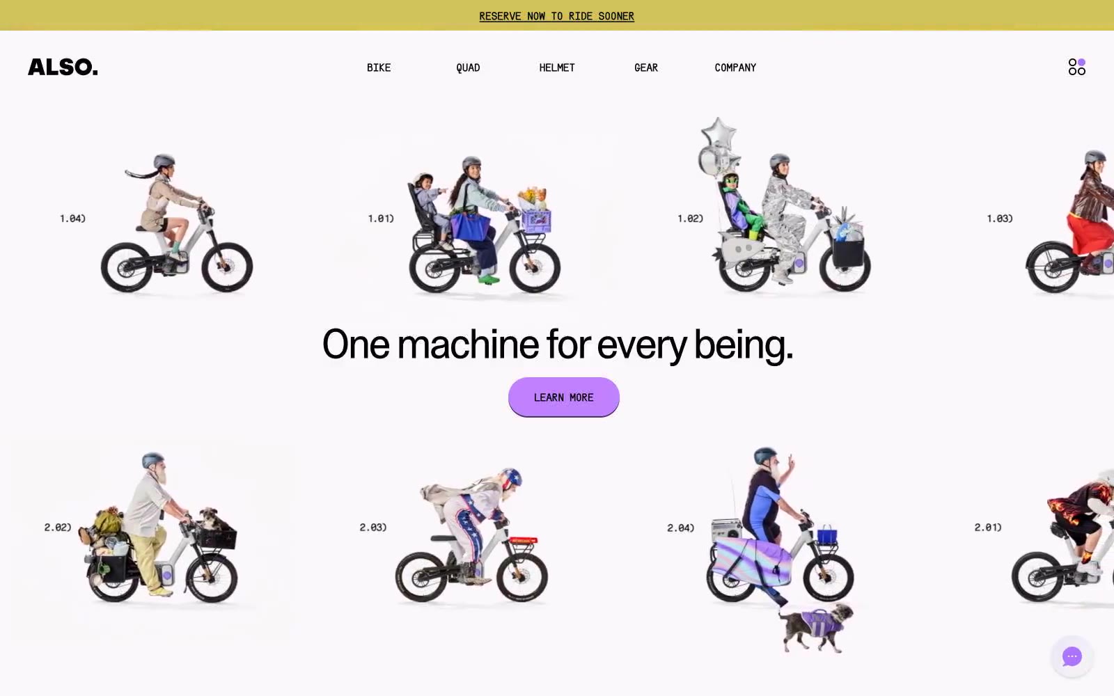
ALSO reads as a confident, editorial product showcase — a bicycle zine reimagined for the web rather than a conventional e-commerce interface. A warm cream canvas (#fcf7fa) carries every surface while a single electric violet (#ac74fc) does the work of an entire color system, appearing on links, borders, highlights, and the dominant CTA fill. Type is whisper-tight: ABCCameraPlainVariable pushes negative tracking harder as size grows and line-heights collapse to 0.93 at display, making even the 60px headline feel architectural rather than shouty. Uppercase mono labels (SerialC-Heavy) with positive tracking act as eyebrows, button text, and section markers — the only place the type system opens up. Pill buttons (9999px) sit on hard 2px violet offset shadows with zero blur, reading as stickers pressed onto paper rather than soft UI elevation. Full-bleed violet sections flip the canvas to accent mode without changing typography, spacing logic, or component rules — the same buttons, same shadows, same rhythm, just inverted.