# ARTU — Style Reference
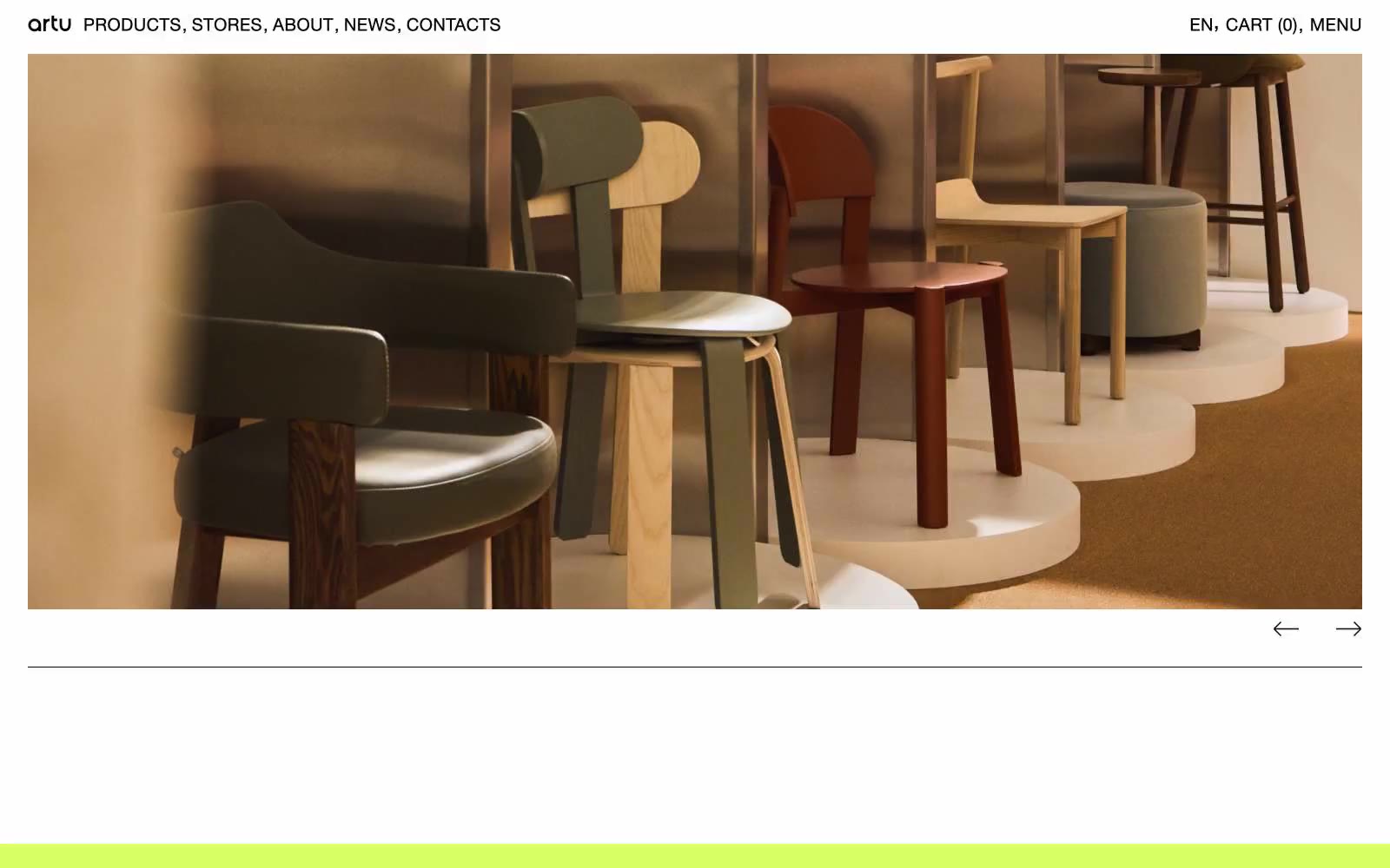
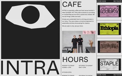
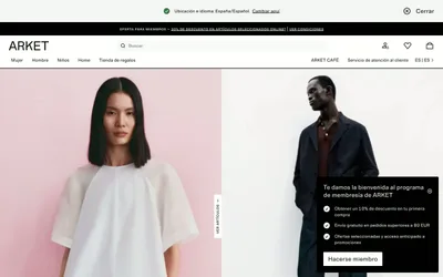
> Gallery wall on white paper. ARTU treats the browser as a museum spread — massive product photography, hairline rules, and a single shock of lime at the bottom edge to close the room.

**Theme:** light

Source measurements are normalized; roles and recommendations are interpreted. Font summary lists are independent, not paired by position. HTML examples are reconstructions, not source components.

ARTU operates as a furniture gallery in browser form: one custom neo-grotesque at a single weight, pure white canvas, product photography that fills the viewport, and almost no visible UI chrome. The discipline is extreme — there is one weight, one type family, two surface colors, and negative space does the work that shadows and gradients do elsewhere. Color is used surgically: a high-chroma lime green (#d7ff66) punctuates only the footer band as a terminal signal, while a raw red (#ff1313) appears as thin border lines and icon strokes — deliberately failing contrast, it functions as graphic rhythm, not information. The result reads less like a commerce site and more like an art-book spread: the products are the layout, the layout is whitespace, and the UI is a thin black line of all-caps navigation at the top edge.