# My Brentano — Style Reference
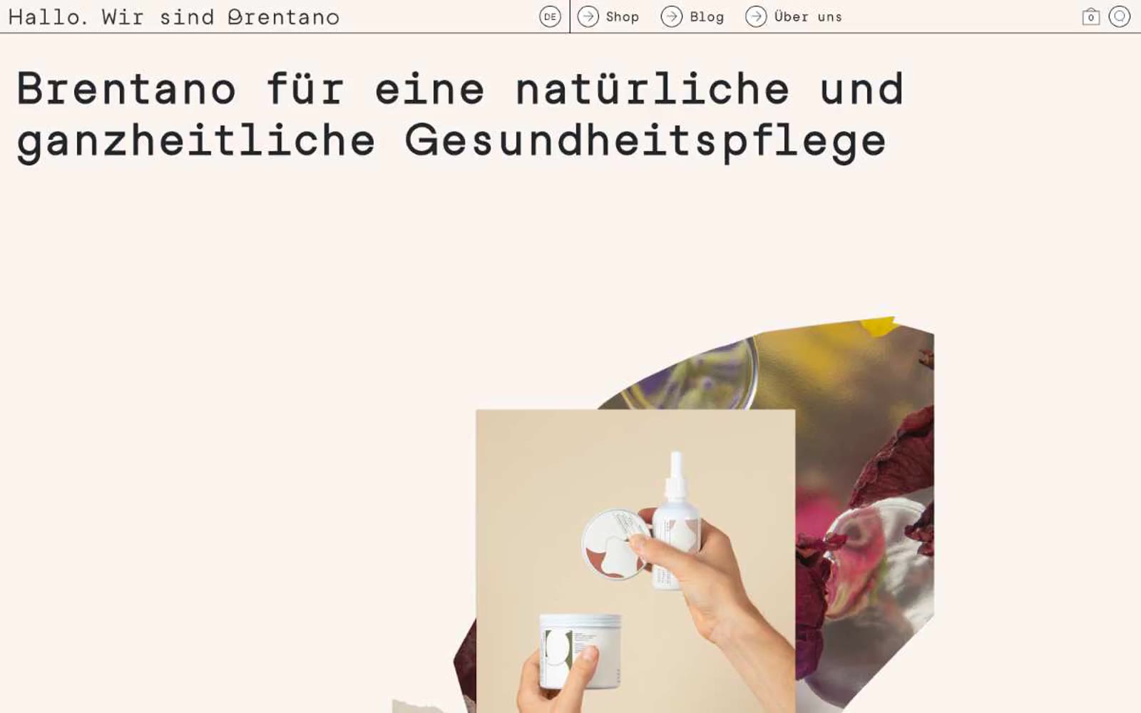
> Pharmacy broadsheet on cream paper. A Swiss editorial layout where one typewriter voice does all the speaking and warm-toned product photography supplies the only color.

**Theme:** light

Source measurements are normalized; roles and recommendations are interpreted. Font summary lists are independent, not paired by position. HTML examples are reconstructions, not source components.

My Brentano channels a Swiss-editorial pharmacy aesthetic: warm cream canvas, one typewriter-serif display face at monumental sizes, and a single near-black ink for almost everything. The design is radical in its restraint — no shadows, no rounded cards, no accent colors, no gradient washes. Hierarchy is built through typographic scale (60px display down to 15px body) and generous negative space, not through color or elevation. Imagery is the only chromatic moment: warm product photography with beige, mustard, and burgundy tones that bleed off-frame. Components feel like printed editorial: thin horizontal rules, circular outlined arrows, and text-aligned links with no fills. Every surface sits on the same flat plane; the design is a typographic object, not a digital interface.