# Raus — Style Reference
> Warm cabin journal on cream paper — every page a postcard from the woods.

**Theme:** light

Source measurements are normalized; roles and recommendations are interpreted. Font summary lists are independent, not paired by position. HTML examples are reconstructions, not source components.

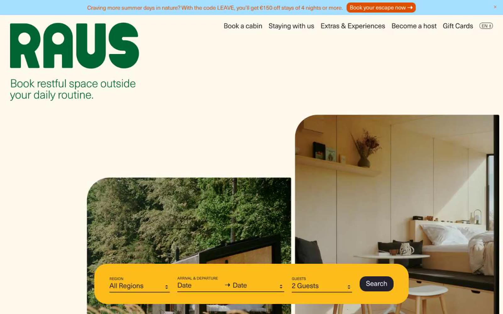
Raus is an editorial cabin-booking platform rendered as a warm, hand-printed travel journal: cream paper backgrounds, generous generous breathing room, and photography that sits beside text rather than beneath it. The brand uses a deep forest green as a calm, non-shouting identity color — present in the wordmark and key links but never screaming — while a bright marigold yellow search bar acts as the single visual exclamation point on each page, anchoring the booking flow. Typography does the heavy lifting: a single neo-grotesque face set at weight 300 with tight negative tracking creates an airy, almost whispered voice that contrasts with the confident, rounded geometry of the components. Surfaces are warm and matte, corners are generously rounded (20px is the default, 40px for hero cards), and shadows are absent — depth comes from layering cream on cream, not elevation.