# Visual — Style Reference
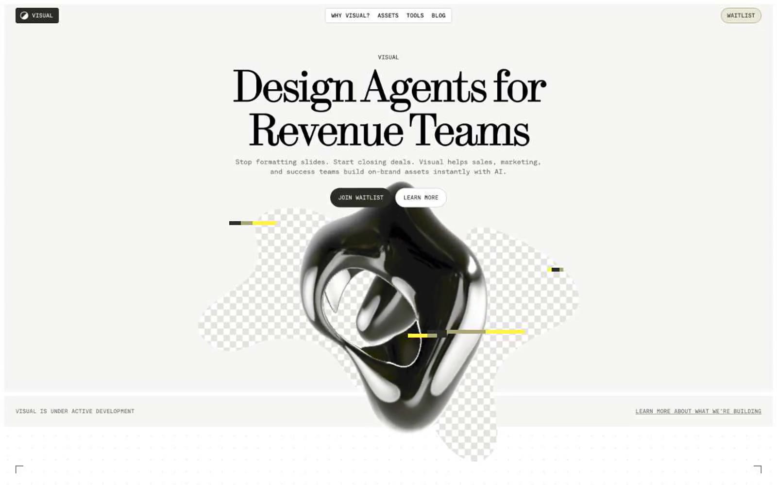
> Warm editorial zine. Cream paper, serif posters, mono marginalia, a single yellow highlighter mark.

**Theme:** light

Source measurements are normalized; roles and recommendations are interpreted. Font summary lists are independent, not paired by position. HTML examples are reconstructions, not source components.

Visual speaks an editorial design dialect: a warm cream canvas (#f6f6f4) holds a high-contrast modern serif at near-poster sizes (64–96px) paired with monospaced UI text at 12–16px. The palette is near-monochrome — warm blacks, olive-sage neutrals, and a single vivid yellow (#fff347) deployed as decorative punctuation on accent bars and highlight washes. Surfaces stay flat with hairline 1px borders; visual hierarchy comes from color contrast and generous 80px section gaps, never from shadows. Components are lightweight and geometric: 8px-radius cards, 3px-radius nav, tiny all-caps mono labels, and a neutral dark button that reads as 'next' rather than 'buy now'. The overall feel is a design museum catalog that happens to contain a product — confident, restrained, and slightly cerebral.