# Doo — Style Reference
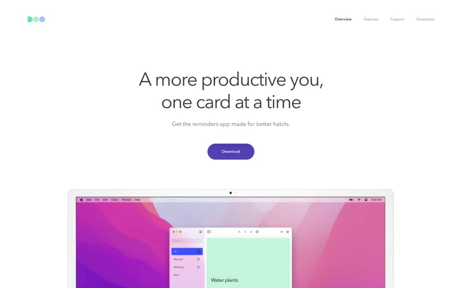
> pastel sticky notes drifting on white linen

**Theme:** light

Source measurements are normalized; roles and recommendations are interpreted. Font summary lists are independent, not paired by position. HTML examples are reconstructions, not source components.

Doo reads as an empty notebook waiting to be filled: nearly all-white canvas, cool-gray hairline borders, charcoal type, and a single deep-indigo CTA acting as the page's only saturated punctuation. The visual system is deliberately monochrome on the surface while the product itself is colorful — colored category tags, pastel task cards, and a tri-color logo carry the warmth. Layout is centered, symmetrical, and Apple-like in its discipline: a single headline, one button, then product imagery doing all the visual work. Components are pill-shaped controls with generous radius, text-first hierarchy, and almost no decoration — no shadows, no gradients, no background tints behind content. The mood is calm, organized, and unhurried.