# Vetric — Style Reference
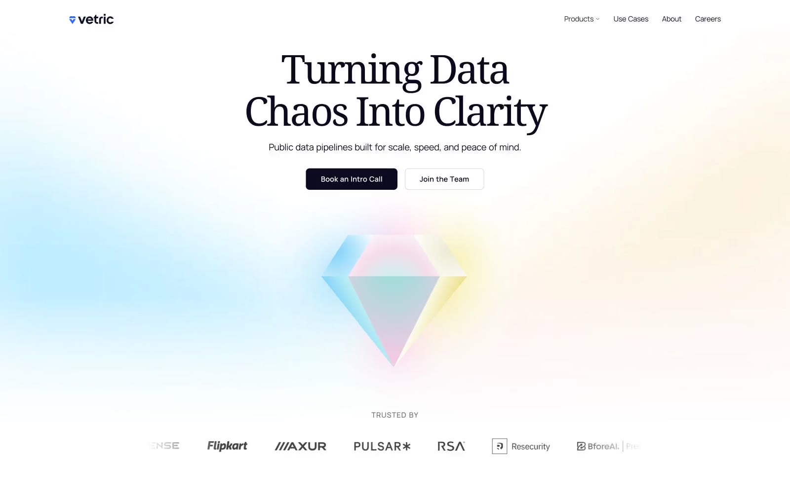
> Iridescent prism refracting clarity — a white room with one glass diamond that throws pink, blue, yellow, and green light across every surface.

**Theme:** light

Source measurements are normalized; roles and recommendations are interpreted. Font summary lists are independent, not paired by position. HTML examples are reconstructions, not source components.

Vetric uses an iridescent-prism visual language: a bright white canvas, near-black ink for text and actions, and a four-color rainbow accent set (blue, pink, yellow, green) that refracts across soft pastel washes like light through a glass diamond. The system pairs a humanist serif (Noto Serif) for headlines with a geometric sans (Manrope) for UI, creating a deliberate tension between editorial calm and technical confidence. Components stay light and flat — thin borders, gentle radii, no drop shadows — so the prismatic gradients and colored accents carry all the visual energy. The result reads as 'data made luminous': the chrome recedes, the color talks.