# Atelier Deux-Cé — Style Reference
> Sunlit editorial gallery

**Theme:** light

Source measurements are normalized; roles and recommendations are interpreted. Font summary lists are independent, not paired by position. HTML examples are reconstructions, not source components.

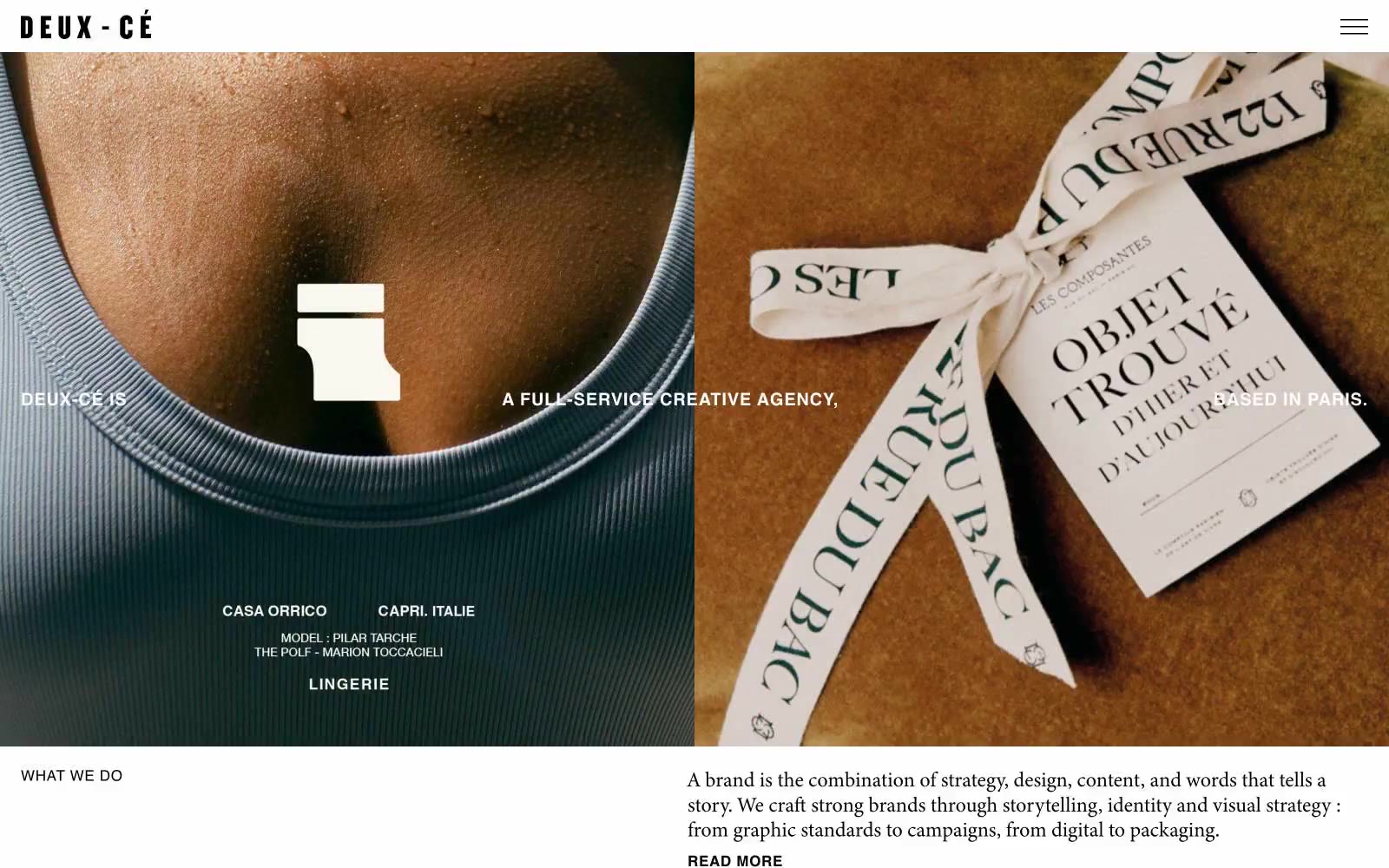
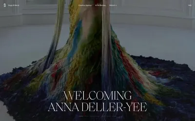
Atelier Deux-Cé presents itself as a sunlit editorial gallery — a Paris-based creative agency whose site reads like a curated magazine spread rather than a software product. The system is photography-first: full-bleed images dominate every screen, with type acting as quiet captions and labels rather than interface chrome. A palette of warm, sun-bleached earth tones (cream, linen, sage, taupe, olive stone) replaces the typical white/gray SaaS canvas, giving every page the warmth of a Provençal villa. Black type sits at near-maximum contrast against these warm surfaces, and a single saturated green is reserved for the footer like a garden border at the end of a path. Components are deliberately few and weightless — no shadows, no gradients, no borders thicker than hairlines, no rounded corners fighting the editorial print sensibility.