# sunday — Style Reference
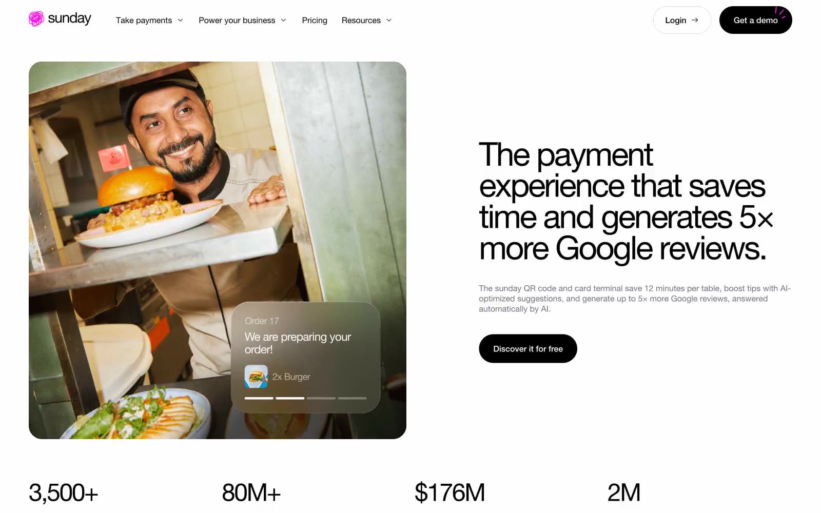
> white gallery with a neon pulse — a clean Helvetica poster where one hot pink line cuts through the black-and-white calm.

**Theme:** light

Source measurements are normalized; roles and recommendations are interpreted. Font summary lists are independent, not paired by position. HTML examples are reconstructions, not source components.

Sunday is a white-canvas payment brand for hospitality with a single neon pink accent that acts as electric punctuation against an otherwise achromatic system. The visual logic is almost editorial: type does the heavy lifting, photography provides warmth, and color appears only where attention must land. Black is the structural default — text, borders, cards, primary buttons, even the feature section's background — while #ff17e9 is reserved for brand signals (logo, active nav, highlighted headings, badge borders). The type system is unified under one family (Helvetica Neue) but spans an extreme range from 12px captions to 200px stat numerals, with aggressive negative tracking at large sizes and positive tracking on small uppercase labels. Surfaces are flat — almost no shadows, reliance on hairline borders and contrast instead. Components lean rounded: 16px for cards and inputs, 64px pill for primary buttons, 100px for tags. The overall feel is confident minimalism warmed by real restaurant photography and one unmistakable neon pulse.