# Freitag — Style Reference
> Swiss industrial catalog — a printed manifest of truck tarpaulins laid flat on poured concrete, where the only color is the recycled product itself.

**Theme:** light

Source measurements are normalized; roles and recommendations are interpreted. Font summary lists are independent, not paired by position. HTML examples are reconstructions, not source components.

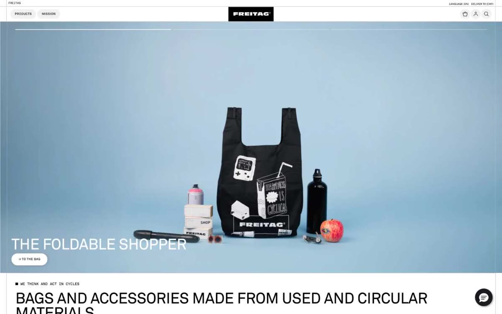
Freitag operates as a Swiss industrial catalog in monochrome: an almost color-zero system where the only chromatic surface is the product itself (truck tarpaulin bags bleeding red, yellow, blue, green). The UI is a grid of black, white, and concrete gray, serving as a neutral stage for the circular-economy merchandise. Typography is compressed and uppercase-driven (Akkurat Standard), line-heights tight as machinery, letterspacing wide on labels, and interactive elements shaped as horizontal pills with hard-edged 1px outlines. Layout follows a strict modular grid — full-bleed 50/50 hero, then 3-column category blocks, then 6-column product matrices. The signature trick: the site reads as a technical specification sheet or shipping manifest, not a fashion storefront. Components feel like they're stamped on the page rather than designed — pill buttons, thin rules, hairline grids, and almost no shadow depth.