# Dock — Style Reference
> Sunlit cream paper, cobalt pulse

**Theme:** light

Source measurements are normalized; roles and recommendations are interpreted. Font summary lists are independent, not paired by position. HTML examples are reconstructions, not source components.

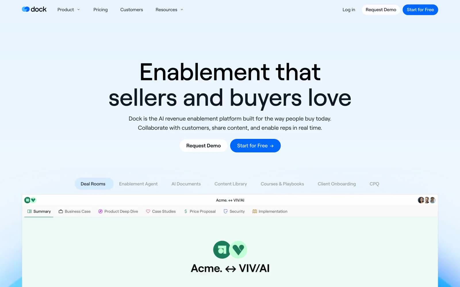
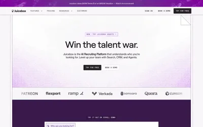
Dock operates in a sunlit, cream-warm workspace language: a soft #faf9f7 canvas replaces the usual pure-white SaaS backdrop, giving every screen a paper-like, approachable feel. Typography carries the weight — 84px Roobert display headlines sit alongside 16px body text with generous breathing room, letting the copy feel like confident printed prose rather than UI chrome. A single electric cobalt blue (#0068f9) punctuates the calm neutrals as the only interactive color: filled CTAs, active states, and links all share this vivid hue, while a secondary violet (#6736eb) appears sparingly as decorative accent. Components stay featherlight — pill-shaped buttons, hairline borders, soft elevated cards, and zero heavy shadows — so the product screenshots become the visual heroes rather than chrome around them.