# MANNA — Style Reference
> Architecture monograph at golden hour — warm bone pages, rust accent panels, and oversized grotesk display type floating over full-bleed photography.

**Theme:** light

Source measurements are normalized; roles and recommendations are interpreted. Font summary lists are independent, not paired by position. HTML examples are reconstructions, not source components.

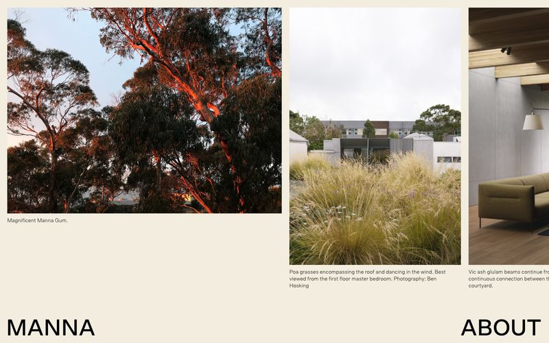
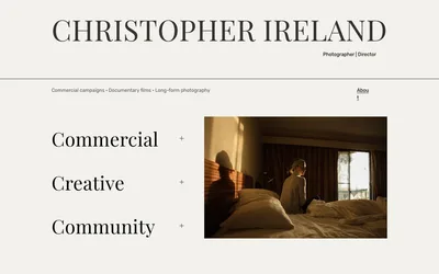
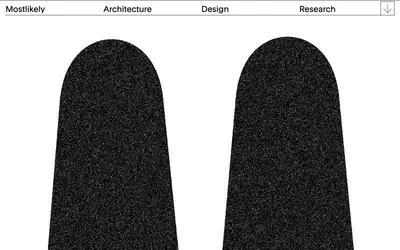
MANNA operates as an architecture monograph laid flat on the screen: expansive photography commands the canvas, typography arrives in two scales (whisper and shout), and the page alternates between warm bone and terracotta rust like rooms in a sunlit house. There is almost no UI chrome — no buttons, no cards, no rounded containers — instead images sit edge-to-edge framed by hairline black rules, and captions float in the gutter beneath. The palette is brutally disciplined: a single chromatic accent (rust orange) used only for full-bleed section panels, everything else is bone white, black ink, and photography. Type is editorial: a geometric grotesk at weight 300 or 500 for monumental display words, a humanist sans for image captions and quiet running text. The result feels less like a website and more like the opening spread of an architecture book.