# sweetgreen — Style Reference
> farm-stand chalkboard at golden hour

**Theme:** light

Source measurements are normalized; roles and recommendations are interpreted. Font summary lists are independent, not paired by position. HTML examples are reconstructions, not source components.

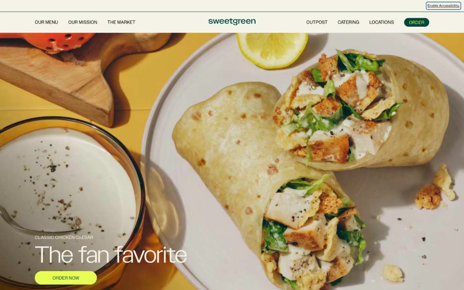
Sweetgreen's design system is a warm, farm-stand-meets-modern-typography aesthetic: a cream canvas (#f4f3e7) rooted in natural materials, with deep forest green as the structural anchor and electric lime (#e6ff55) as a singular, high-energy action color. Photography carries the brand — saturated, overhead food shots on warm tile, ceramic, and concrete surfaces are treated as heroes, never as decoration. Typography does the heavy lifting on chrome: a custom geometric sans (SweetSans) renders oversized category labels and hero headlines at extreme weights (400 at 70–80px, with 0.85 line-height that lets letters nearly touch), while a secondary ultra-light display face (Grenette at 200) creates contrast through restraint. Components are deliberately spare — pill-shaped buttons, ghost text links with arrows, badge-free product cards — letting the food and the headline typography own every screen.