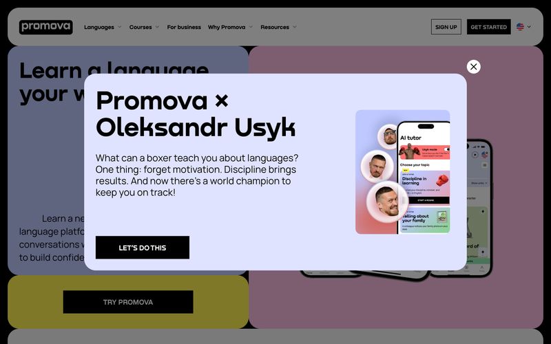
# Promova — Style Reference
> midnight magazine with one yellow highlighter — a black page, white type, and a vivid lemon swatch that says 'press here'.

**Theme:** dark

Source measurements are normalized; roles and recommendations are interpreted. Font summary lists are independent, not paired by position. HTML examples are reconstructions, not source components.

Promova is a midnight-magazine language learning surface: near-black canvas, white type, a single electric yellow (#fff050) used as functional punctuation for the primary action and icon highlights. Headlines are set in Nekst, a custom display face used exclusively at oversized scales (40–140px) — never as UI text — giving every screen a confident editorial weight. Body and interface type run on Manrope from 200 to 700, with weight 200 doing the work most sites assign to 300. The system is ruthlessly monochromatic (1% colorfulness) and the visual rhythm comes from oversized type, generous 30px corner radii, and the yellow accent appearing only where action or attention is required. Components feel like magazine spreads rather than dashboard widgets: flat, rounded, low-elevation, with cards that read as paper inserts against the black page.