# Specht Studio — Style Reference
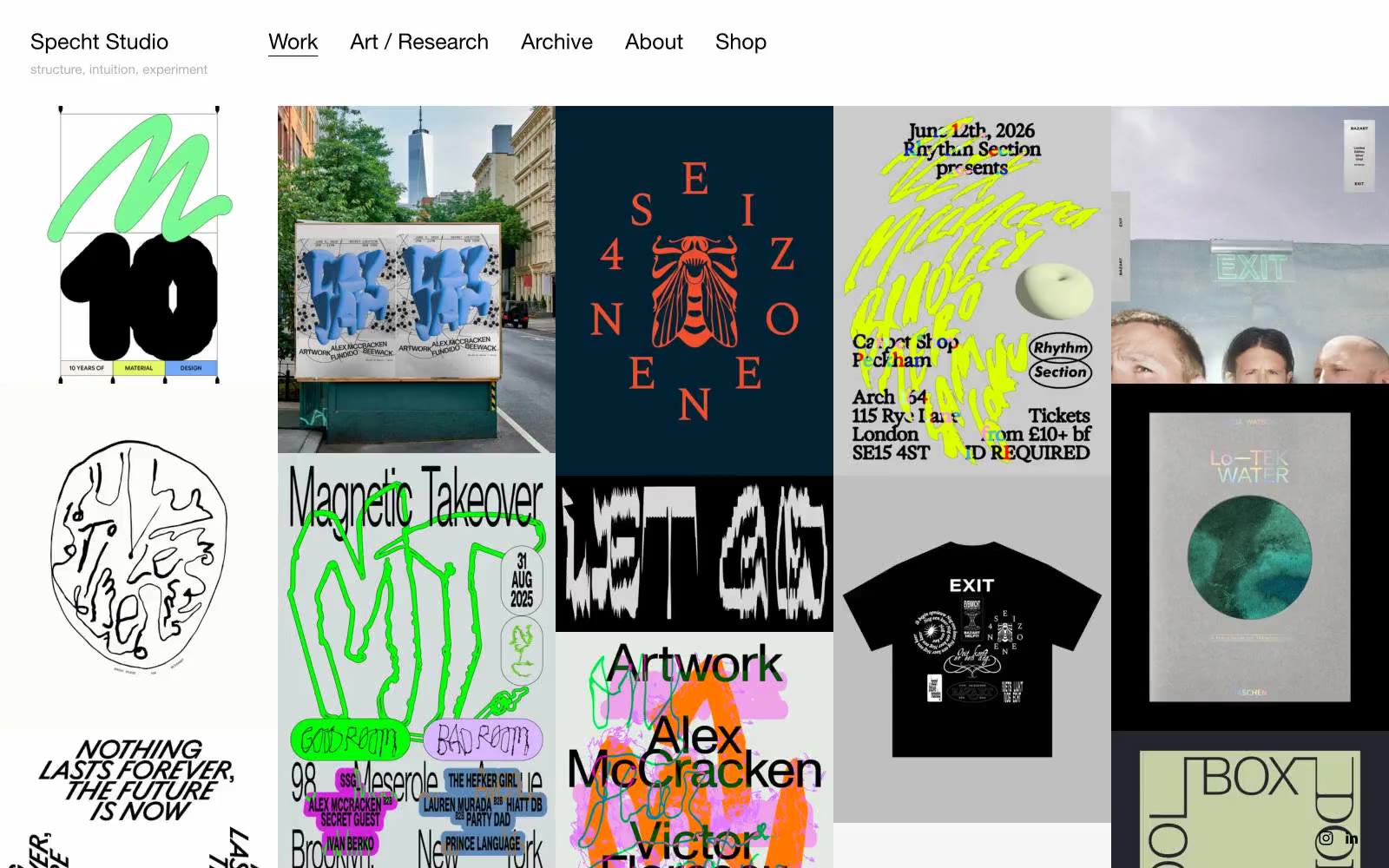
> Gallery wall of restrained curiosity. The studio's own chrome is a white plane and black type; the visual fireworks live entirely inside the project tiles.

**Theme:** light

Source measurements are normalized; roles and recommendations are interpreted. Font summary lists are independent, not paired by position. HTML examples are reconstructions, not source components.

Specht Studio is a curatorial frame, not a design showcase — the website removes every trace of itself so the portfolio work can hang on a neutral gallery wall. The chrome is aggressively monochrome: a single typeface, a single weight, black and gray ink on a near-white plane. There is no brand color, no CTA, no marketing surface — navigation is bare text and the grid of project tiles does all the work. The system achieves its identity through what it withholds: no shadows, no rounded corners, no gradient washes, no chromatic accent. Any page built in this system should read as a museum catalog, not a product page — the structure is the design, and the work is the content.