# Flowers For Society — Style Reference
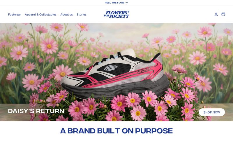
> indigo editorial on white gallery — a single deep-violet voice laid over a paper-white canvas, where the product photograph and the typography do all the talking.

**Theme:** light

Source measurements are normalized; roles and recommendations are interpreted. Font summary lists are independent, not paired by position. HTML examples are reconstructions, not source components.

Flowers For Society is a fashion house that speaks in a single, assertive voice: deep indigo (#203b90) threading through every surface — logo, headings, buttons, borders, and hero scrims — anchored by a white gallery that breathes. The product is the hero: full-bleed photography with gradient overlays for legibility, oversized pill-shaped CTAs at 41-60px radius, and centered display type that uses Integral's tight line-heights (0.92-1.0) to compress vertical space. The system is deliberately minimal — two custom typefaces, no shadows, extreme border radii, and a single chromatic color. Soehne carries the UI with wide letter-spacing (0.033-0.063em) that gives even small text a boutique, editorial cadence. The result feels like a magazine spread: confident, restrained, and unmistakably branded.