# Hatch — Style Reference
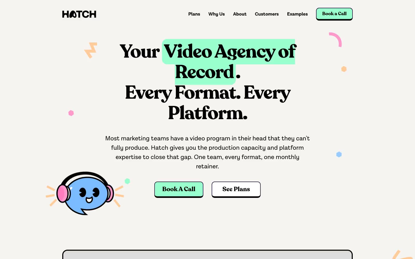
> Hand-drawn zine meets pastel candy store. A cream-paper canvas splashed with mint highlights, confetti dots, and pill-shaped CTAs, where a chunky bold serif whispers fun and a blue mascot winks from the corner.

**Theme:** light

Source measurements are normalized; roles and recommendations are interpreted. Font summary lists are independent, not paired by position. HTML examples are reconstructions, not source components.

Hatch operates as a playful creative-agency brand on a warm cream canvas: the page reads like a hand-illustrated zine rather than a corporate SaaS site. Recoleta, a chunky high-contrast serif at very large sizes with tight negative tracking, carries every headline while a quiet grotesque (Lota Grotes Que Alt) handles UI and body. A four-color pastel palette — mint, sky, peach, pink — functions as functional punctuation against the cream, with mint green reserved for the primary action and the other three cycling through decorative dots, highlight swashes, illustration strokes, and tag chips. Cards, buttons, and tags lean heavily rounded (16–40px, full pill for CTAs), generous 4px-based spacing creates breathing room, and a recurring visual vocabulary of hand-drawn mint highlight swashes, confetti dots, and a cute blue mascot character threads the whole system together.