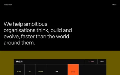
# Josh Warner — Style Reference
> black void gallery wall

**Theme:** dark

Source measurements are normalized; roles and recommendations are interpreted. Font summary lists are independent, not paired by position. HTML examples are reconstructions, not source components.

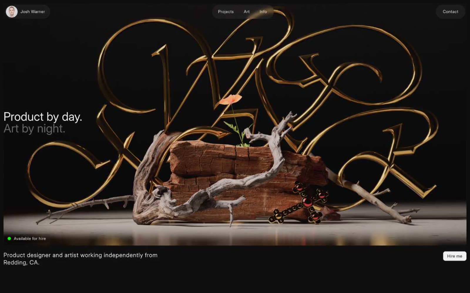
Josh Warner's portfolio operates as a near-pure black gallery wall: the interface recedes so that 3D renders, product mockups, and photographic compositions can dominate every viewport. Typography is whisper-thin and uniformly weighted at 400 across the scale, using a single sans-serif family that refuses to shout — hierarchy is built through size and generous letter-spacing (0.04em) rather than weight contrast. The entire palette is achromatic except for a single electric green status dot (#08ff00), which functions as the site's only living signal against the void. Surfaces are flat or near-flat; depth is borrowed entirely from the artwork, not from drop shadows or gradients. Components are sparse, pill-shaped, and almost weightless — ghost buttons, hairline borders on #000, circular avatars, and pill nav items. The system is a frame, not a subject.