# Co2 — Style Reference
> climate atlas in winter light. Build pages as an airy document landscape where serif headlines, category-coded data, and icy image treatments punctuate broad white fields.

**Theme:** light

Source measurements are normalized; roles and recommendations are interpreted. Font summary lists are independent, not paired by position. HTML examples are reconstructions, not source components.

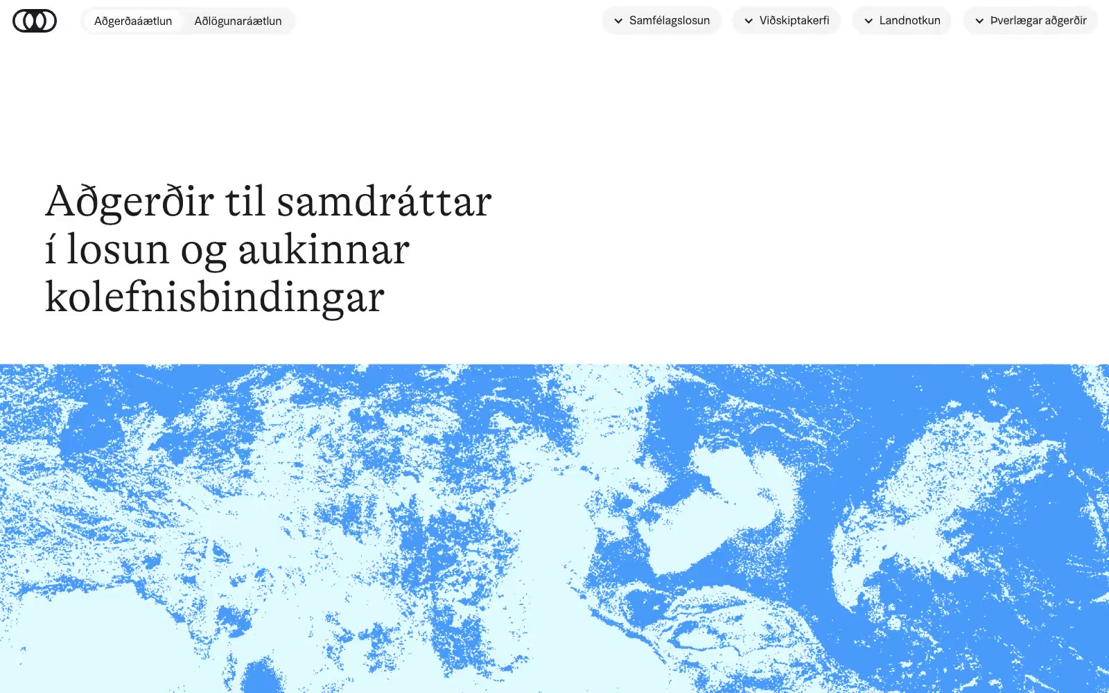
Co2.is frames public climate-policy information as a quiet editorial archive: expansive white space, hairline rules, and low-contrast pill navigation leave room for oversized, whisper-weight serif statements. A near-black editorial ink carries all reading and controls, while pale cyan and mint blocks mark filters and responsible bodies rather than turning the interface into a brightly branded dashboard. Saturated blue, teal, violet, orange, and yellow appear as a compact classification language for climate systems, with a high-contrast blue-and-white environmental image providing the hero’s only large visual interruption.