# Ableton — Style Reference
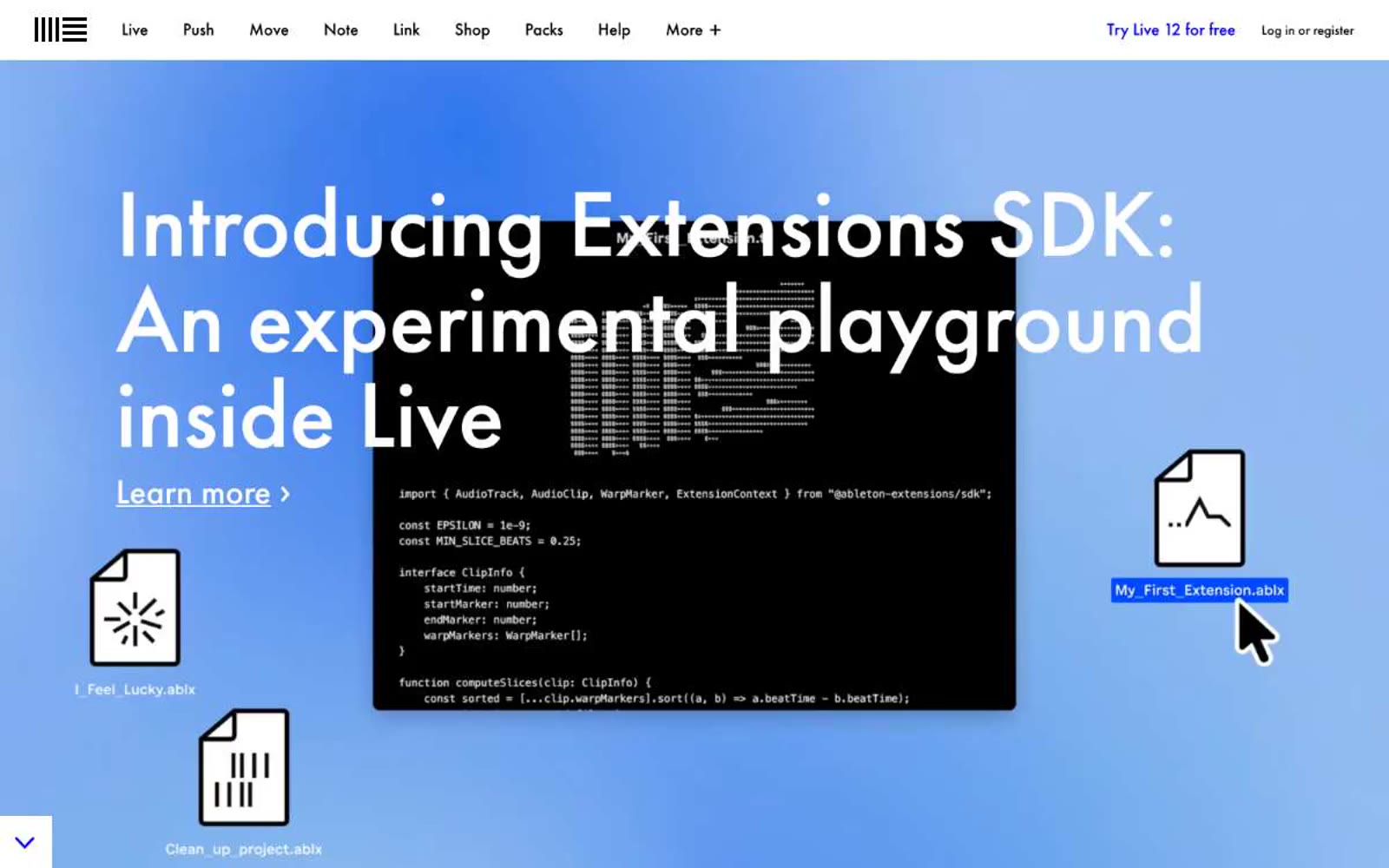
> Editorial workshop on stark white. White paper, black Futura, one blue pen mark for interactivity, photography clipped flush to the edges like magazine spreads.

**Theme:** light

Source measurements are normalized; roles and recommendations are interpreted. Font summary lists are independent, not paired by position. HTML examples are reconstructions, not source components.

Ableton's visual system reads like a working studio's editorial wall: stark white canvas, Futura PT geometry, and one confident blue that marks every interactive text. The site is text-first and almost ruthlessly flat — no shadows, no rounded corners, no decorative chrome — letting photography of musicians, hardware, and software do the emotional work. Color appears as small functional punctuation: a vivid blue for links, plus coral and teal tag fills that categorize content without softening it. Navigation is a thin top bar of monospace-feeling product names. The overall feel is that of a well-set technical manual that happens to be beautiful — information density carried by typography and image, not by container design.