# Surface — Style Reference
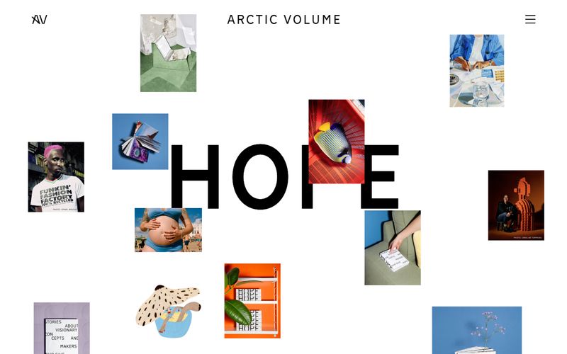
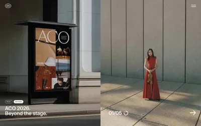
> editorial gallery on bone linen — a single 230px word anchors scattered photography against pure off-white, with everything else reduced to a whisper of black type.

**Theme:** light

Source measurements are normalized; roles and recommendations are interpreted. Font summary lists are independent, not paired by position. HTML examples are reconstructions, not source components.

Surface is a print-publication-shaped digital editorial: a bone-white canvas (#f7f7f7) where almost everything is black type, with the layout itself acting as the brand. The visual system is radical in its restraint — no accent color, no borders, no shadows, no gradients, no rounded corners. Instead, personality comes from the type scale (a 230px display weight) and from deliberately placed editorial photography that breaks the grid at angles. Navigation is reduced to a monogram, a wordmark, and a hamburger. Content sections breathe with wide left margins and generous vertical padding, reading like a magazine spread rather than a web product. An AI agent should treat this as a 'design system of absence' — every added element must earn its place against the white field.