# Telescope — Style Reference
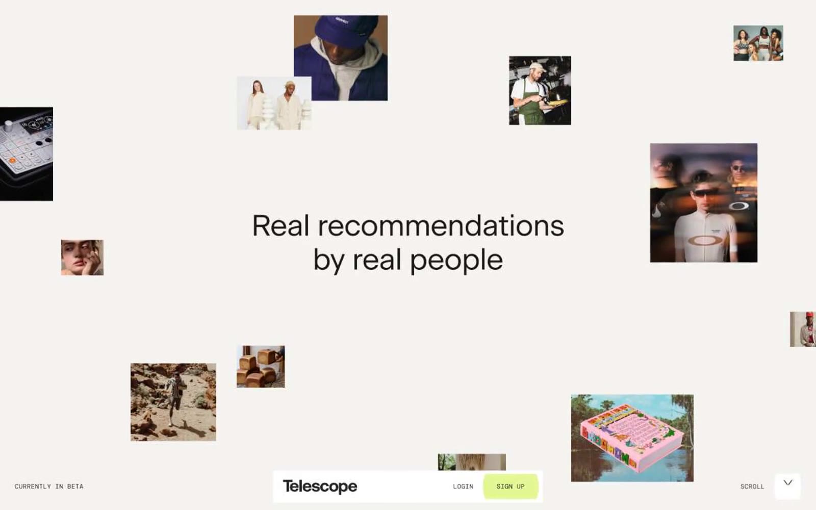
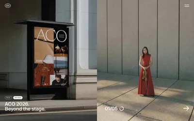
> Editorial pasteboard on cream paper. A warm bone-white canvas with full-bleed magazine photography, one bright lime accent, and serif headlines that lay out around the images like an art director's spread.

**Theme:** light

Source measurements are normalized; roles and recommendations are interpreted. Font summary lists are independent, not paired by position. HTML examples are reconstructions, not source components.

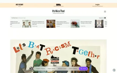
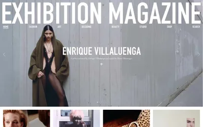
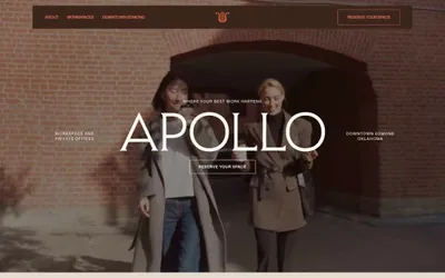
Telescope reads as an editorial fashion magazine printed on warm cream paper: a nearly monochrome world of bone-white canvas, warm near-black type, and full-bleed editorial photography, punctuated by a single vivid lime accent that signals the only interactive surface. The UI is stripped to the bone — no cards, no panels, no decorative chrome — with a fixed bottom bar in mono caps doing all the navigation work and photos floating freely into the headline as if laid out on a pasteboard. Typography does the heavy lifting: a quiet custom serif at generous sizes with tight negative tracking whispers rather than shouts, while the mono labels at 12px are the only typographic texture outside the serif system. Everything is sharp at 2px corners, spacing is generous, and the lime green is rationed — one button, nothing else.