# Bareis + Nicolaus — Style Reference
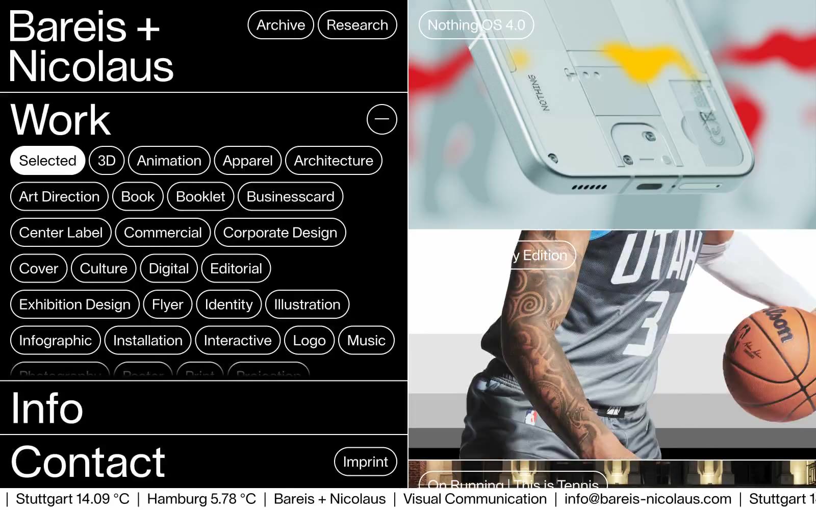
> White chalk on black slate. A typographic control panel and a full-bleed visual index share one strict monochrome stage, with pill-shaped outlines as the only punctuation.

**Theme:** dark

Source measurements are normalized; roles and recommendations are interpreted. Font summary lists are independent, not paired by position. HTML examples are reconstructions, not source components.

Bareis + Nicolaus operates as a monochrome editorial grid: pitch-black canvas, bone-white outlines, and a single typeface carrying the entire voice. The interface is a split workspace — a typographic control column on the left filters and indexes, a full-bleed visual index on the right showcases the work. Every interactive element is a pill: 120px radius, 1px white stroke, no fill, no shadow, no hover fill — the geometry does the work. Typography is the protagonist: 72px display at weight 400 with a 1.0 line-height gives headlines architectural presence without weight, while 24px body text reads as quiet annotation. The system refuses decoration — no gradients, no brand color, no elevation, no rounded cards — and that absence is the identity. Every element earns its pixel by being typographic, structural, or navigational.