# Kalstore® — Style Reference
> Paper atelier on a quiet morning. The interface is warm off-white, sparsely set, and lets one mustard accent and oversized editorial type do the talking.

**Theme:** light

Source measurements are normalized; roles and recommendations are interpreted. Font summary lists are independent, not paired by position. HTML examples are reconstructions, not source components.

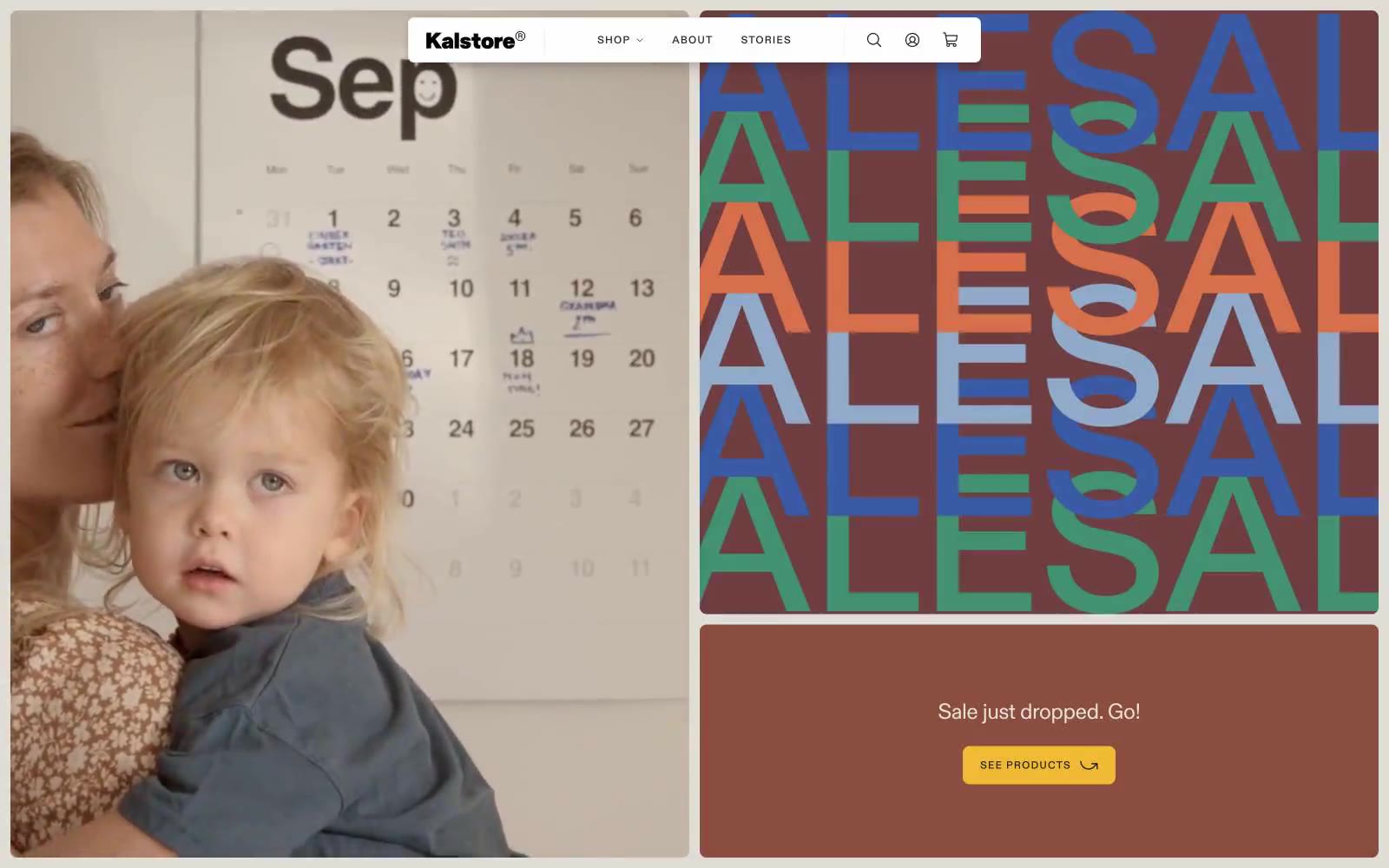
Kalstore is a paper atelier rendered as a quiet editorial spread: warm off-white canvas, sparse generous breathing room, large-scale lifestyle photography, and one warm mustard accent that interrupts the monochrome calm like a sticky note on a drafting table. Typography is the loudest element — a single editorial sans at multiple registers, from whisper-thin 19px body copy to 140px display treatments with aggressively tight tracking. Chromatic color appears almost entirely as editorial art (the ALESAL typographic block uses a palette of terracotta, sage, cobalt, and rust) rather than functional UI, keeping the interface itself disciplined. Components are small, flat, and almost unstyled — thin hairline borders, 8px corners, 6px button padding, barely-there shadows. The overall feel is less e-commerce and more independent magazine.