# Ditto — Style Reference
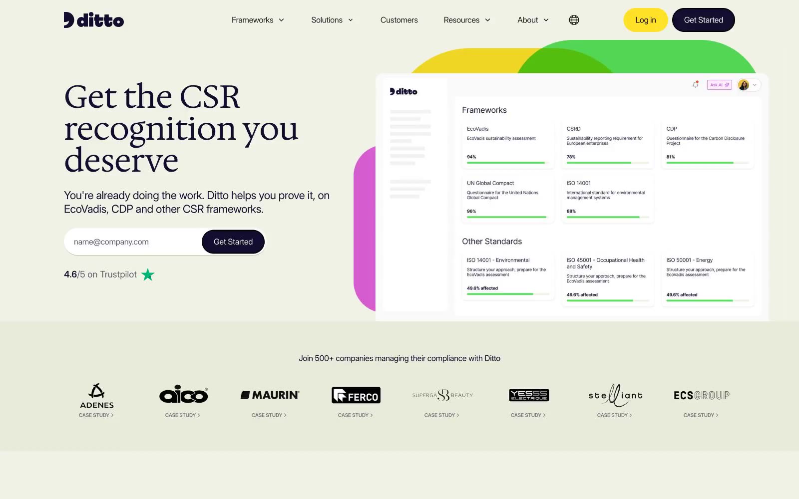
> Sunlit wildflower compliance atelier. Warm cream surfaces, vivid yellow primary action, deep navy ink, organic color shapes blooming behind the product.

**Theme:** light

Source measurements are normalized; roles and recommendations are interpreted. Font summary lists are independent, not paired by position. HTML examples are reconstructions, not source components.

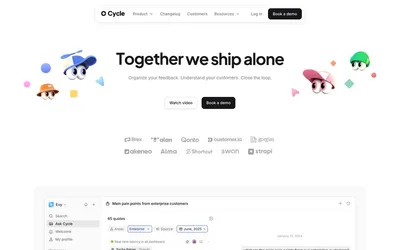
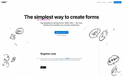
Ditto uses a sunlit, garden-inspired SaaS language: a warm cream canvas, organic decorative blobs in vivid greens, pinks, and yellows, and a confident pairing of a warm serif (Hedvig Letters) for headlines with a clean grotesque (Inter) for everything else. The deep navy-violet #130e30 carries all structural text and borders, while a single bright yellow #ffe228 powers every primary action — the contrast is so high it reads almost like a highlighter. Components stay lightweight: pill-shaped buttons (1440px radius), generously padded cards on a slightly green-tinted surface (#eff2e5), and minimal elevation. The mood is optimistic and approachable, not corporate or clinical — the floral backdrop shapes, serif headlines, and warm neutrals keep it human.