# Perplexity AI — Style Reference
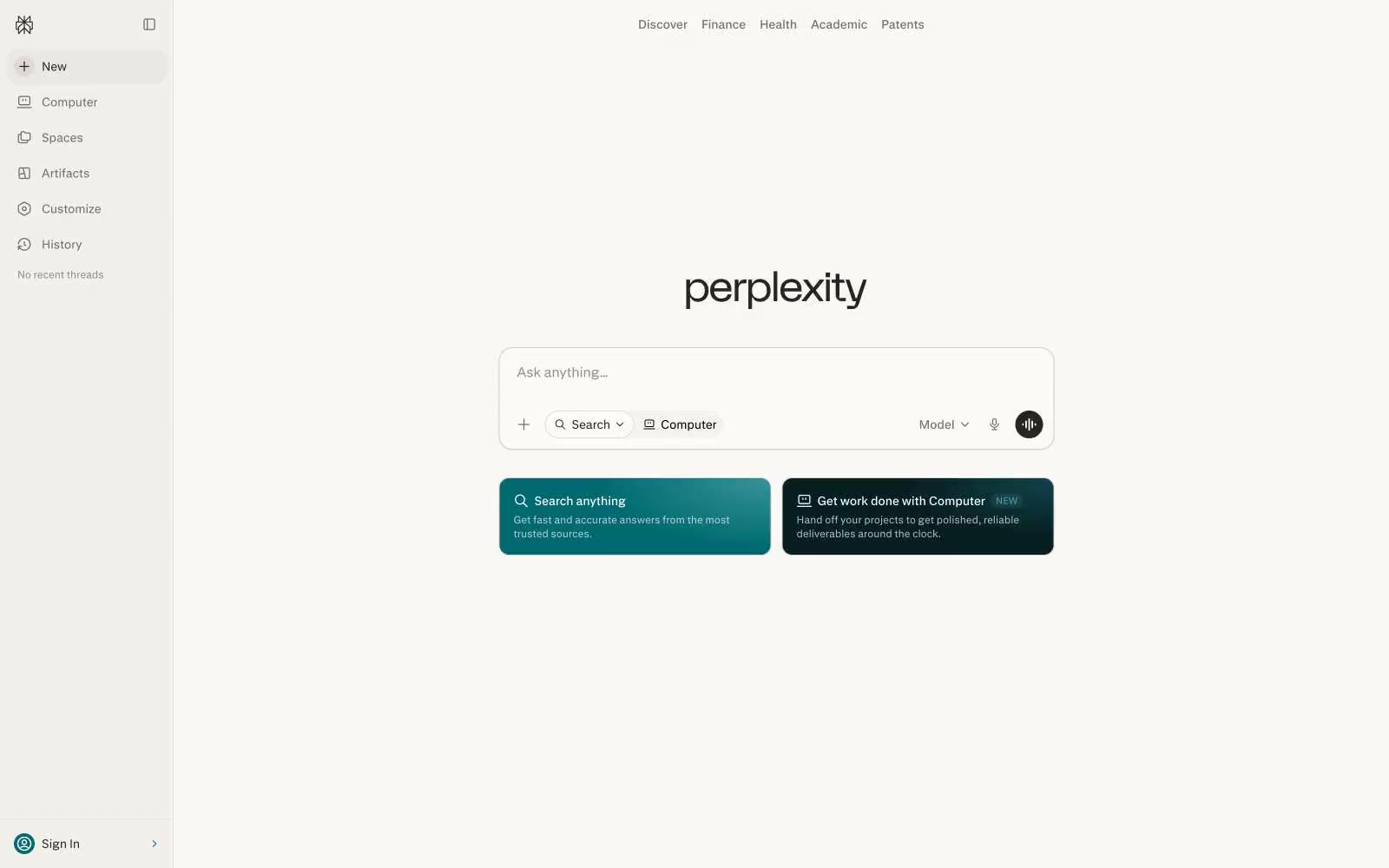
> Warm research terminal. A cream-toned search bar floats on aged-paper canvas, surrounded by quiet monochrome controls — the calm of a library reading desk distilled into a single input field.

**Theme:** light

Source measurements are normalized; roles and recommendations are interpreted. Font summary lists are independent, not paired by position. HTML examples are reconstructions, not source components.

Perplexity's interface operates like a quiet research terminal: a warm off-white canvas (#faf8f5) that reads more like aged paper than sterile app-white, a single monochrome typographic voice, and one restrained teal accent (#016a71) that appears only as functional punctuation. The entire visual system compresses to a search bar as the hero — every surrounding control (sidebar, top nav, model selector, voice button) is a subordinate satellite. Density is compact but not cramped: 8px is the workhorse gap, 12–16px the padding standard, with 9999px pill rounding on all interactive controls. There is almost no elevation — the design is deliberately flat, using a barely-there 1px border at #d1d1cd and a single whisper-soft shadow to separate the card layer from the canvas. Typography is custom (pplxSans) at exactly two weights (400, 500) and three sizes (12, 14, 16) — the scale is intentionally narrow, making the interface feel like a document rather than a dashboard.