# Waka Waka — Style Reference
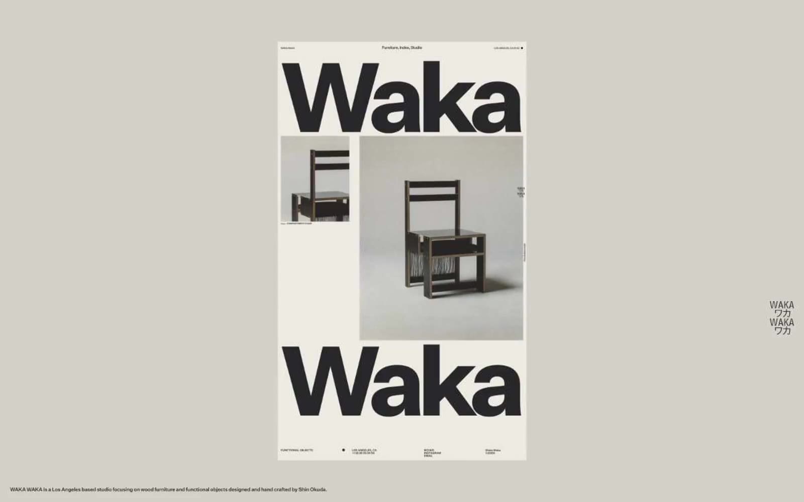
> museum poster in bone and ink — monumental black grotesk type printed on warm off-white paper, everything else recedes

**Theme:** light

Source measurements are normalized; roles and recommendations are interpreted. Font summary lists are independent, not paired by position. HTML examples are reconstructions, not source components.

Waka Waka treats its website like a printed exhibition catalog: a warm bone-colored paper canvas, one near-black ink, and a custom grotesk typeface deployed at both 10px footnote size and 560px monumental scale. The system is essentially monoline and monochromatic — there are no accents, no secondary hues, no gradients, and almost no decorative chrome. Visual hierarchy is created entirely through typographic weight, scale, and whitespace, with the brand's own name acting as the dominant graphic device on every screen. Components are flat, borderless or hairline-bordered, and feel curated rather than interactive — the page reads as a gallery wall of objects and oversized letterforms, not a software interface.