# Gitbook — Style Reference
> warm-white architecture studio with orange highlighter marks

**Theme:** light

Source measurements are normalized; roles and recommendations are interpreted. Font summary lists are independent, not paired by position. HTML examples are reconstructions, not source components.

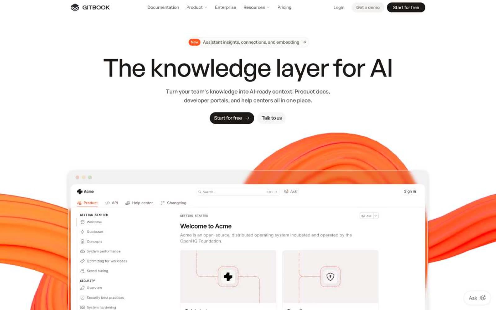
GitBook projects the calm authority of a well-edited reference book: warm-white pages, generous breathing room, and near-black type that commands without shouting. A single vivid orange acts as a highlighter — appearing only in badges, the 'New' pill, the floating Ask widget, and the kinetic 3D shapes that bleed into the hero screenshot. The interface stays almost entirely monochromatic; color is punctuation, not atmosphere. Typography is the visual identity: a geometric bold display face at 45-55px with tight negative tracking creates editorial weight, while Inter handles the dense body copy. Components are paper-like — flat cards, hairline borders, pill buttons, minimal shadow. Everything reads as a knowledge product: structured, legible, confident.